Sway
designed by Emma Linh
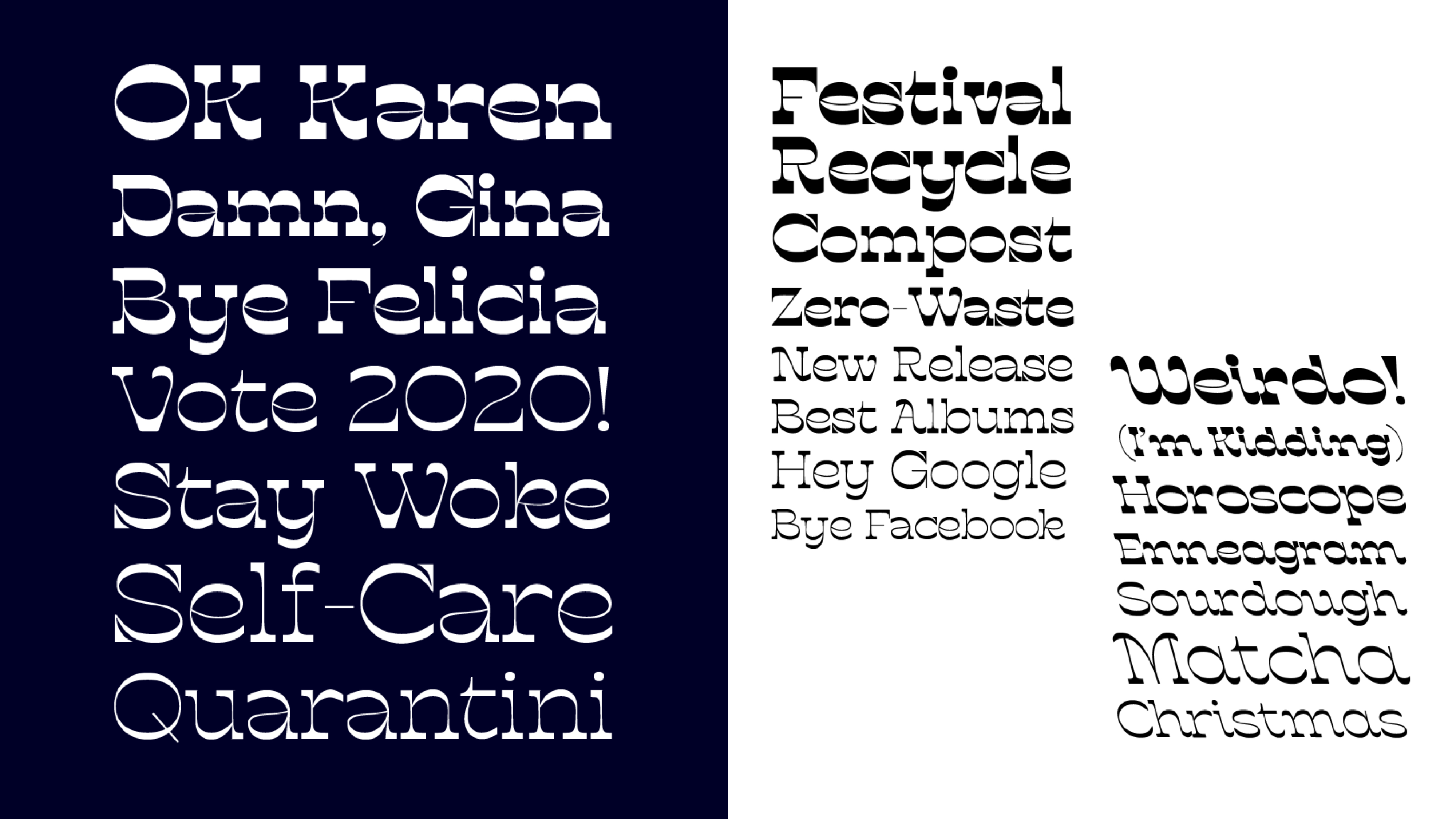
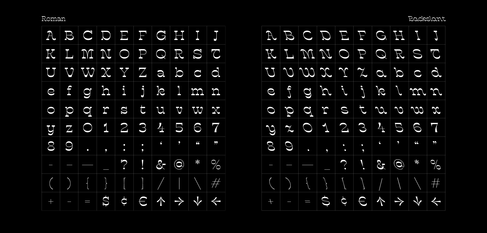
Sway is a reverse-contrast typeface that’s shamelessly offbeat.
Try editing the text!
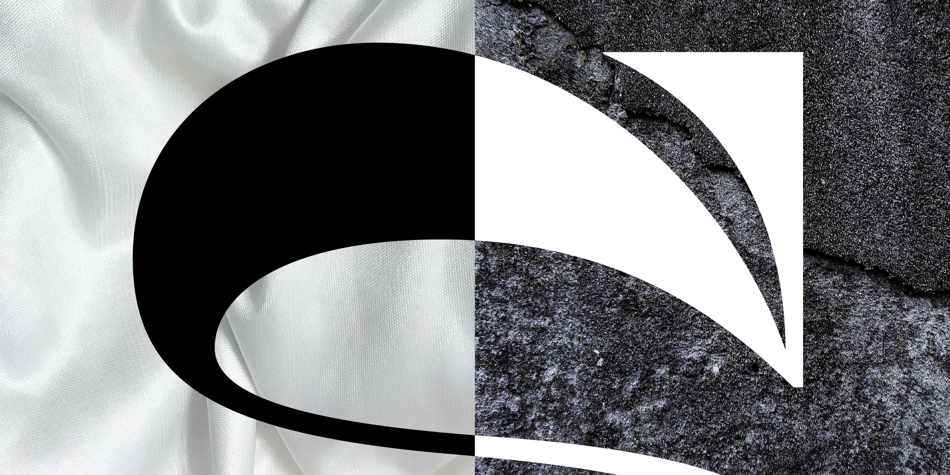
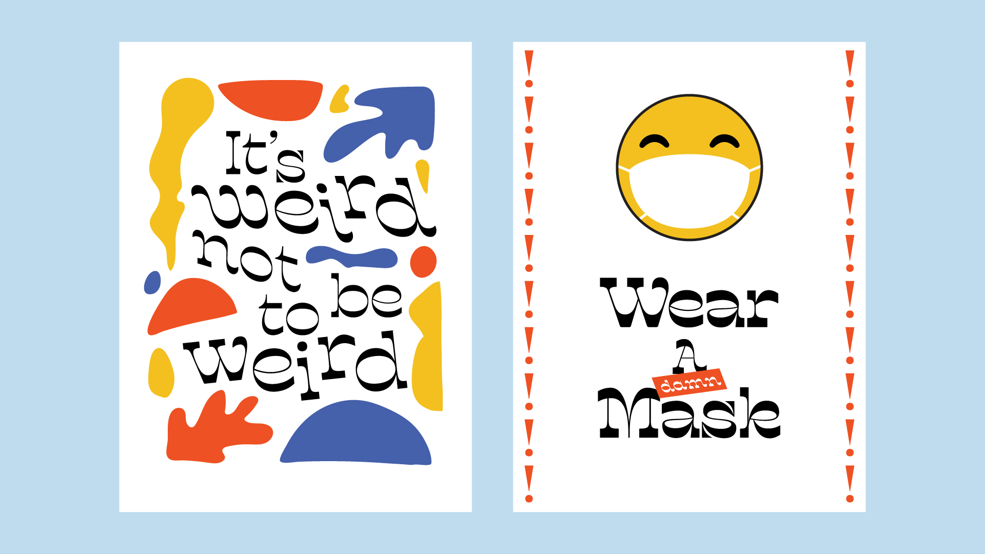
Weirdness is typical in this genre, and this typeface’s quirkiness is emphasized by a game of teetering polar opposites. Angular yet organic. East meets West. Smooth and edgy. There’s obvious tension, but what is a great story without a little conflict?
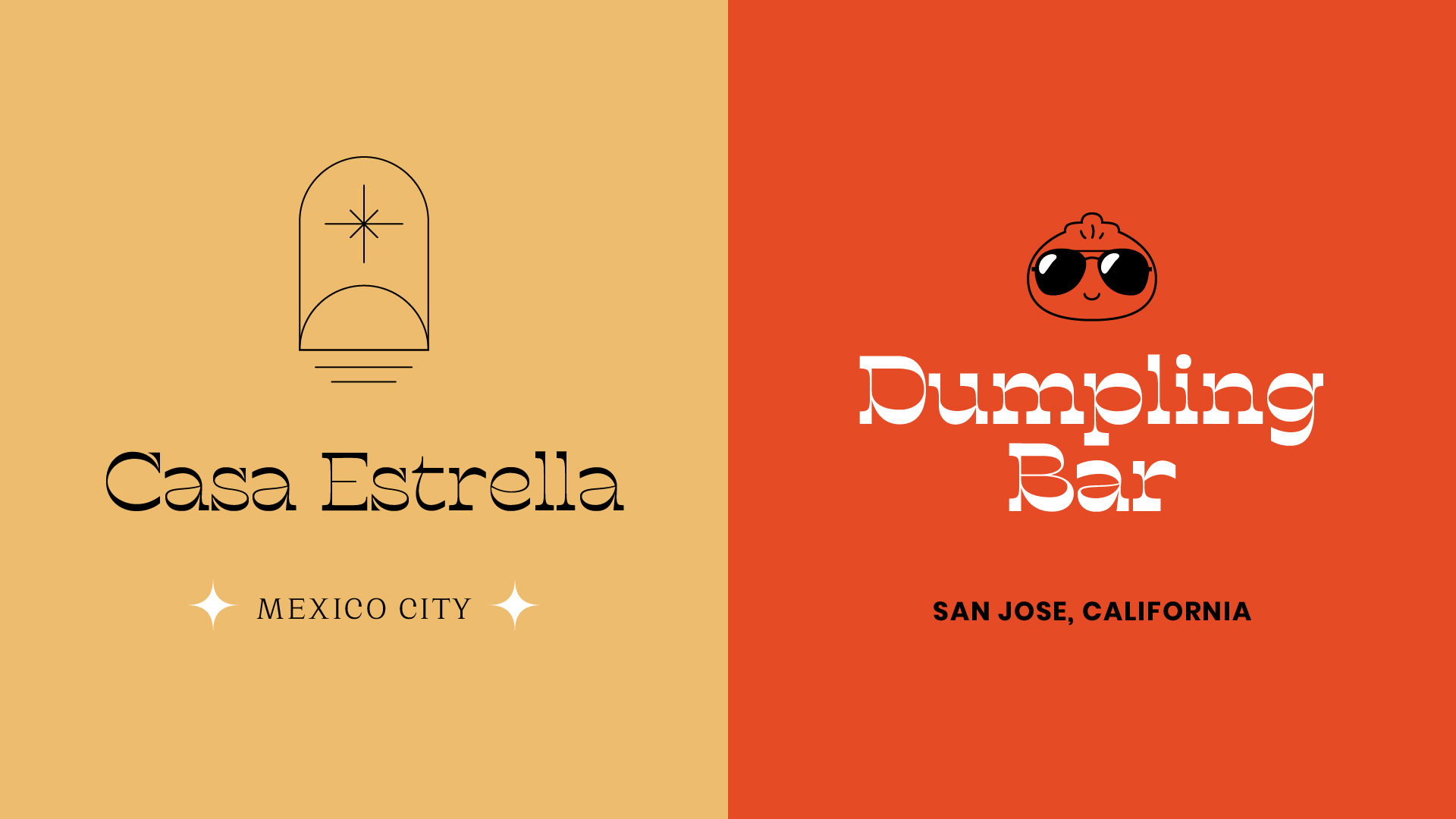
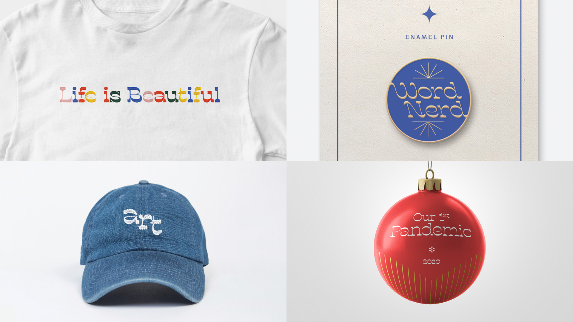
With high contrast and commanding serifs, Sway is made for headlines in advertising and editorials. It’s not intended as a text face, for the reserved or faint of heart. Use it in short bursts of text like music festival branding, liquor labels, or propaganda posters. Or when you want your design to shout, “Yaaaaassss Gaga.”
See more at emmalinh.com/portfolio/sway.
See the process at thedesignloupe.com/process-sway.
Designed by Emma Linh
