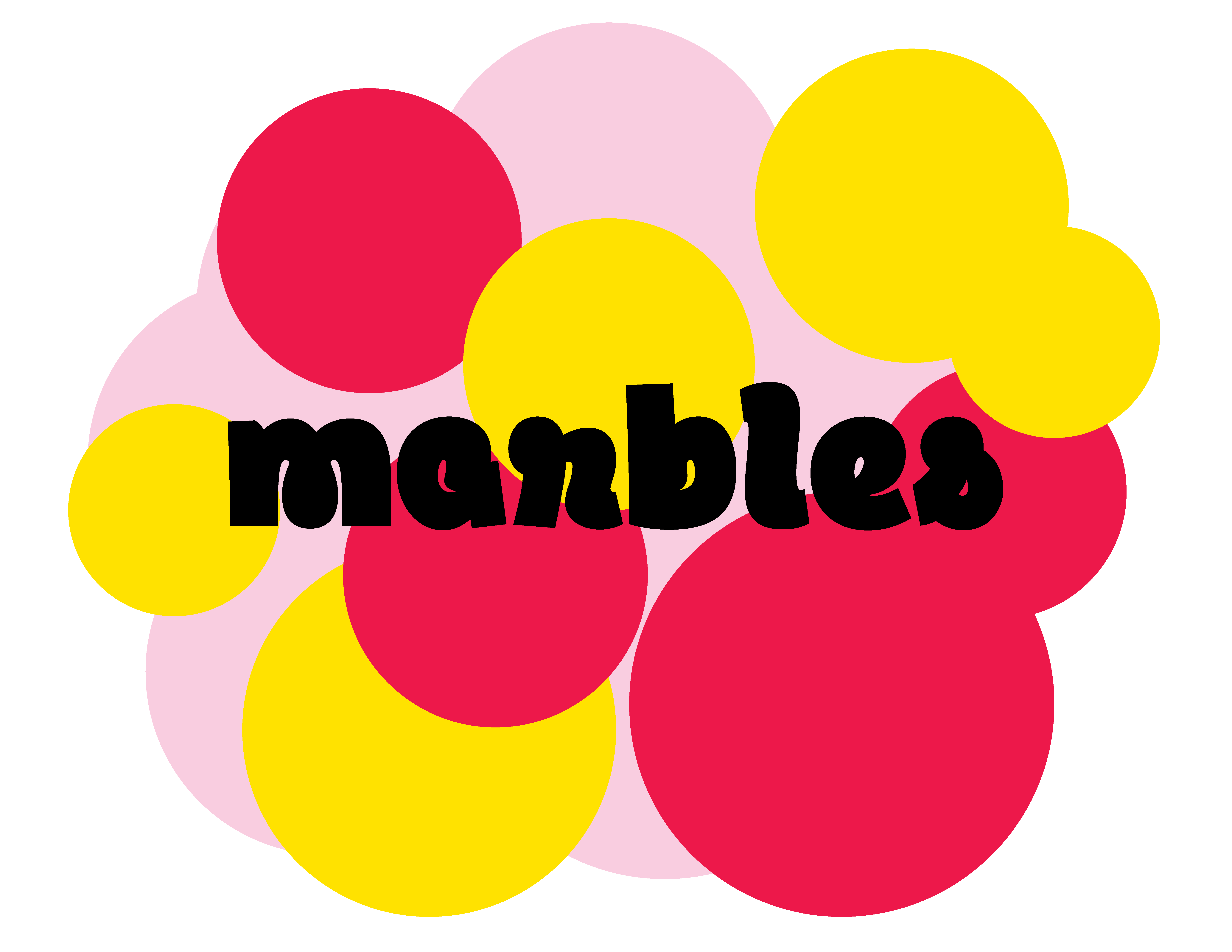
Marbles
designed by Bert Zhang
“My lifetime ambition has been to unite the utmost seriousness of question with the utmost lightness of form.” —Milan Kundera, writer
Try editing the text!
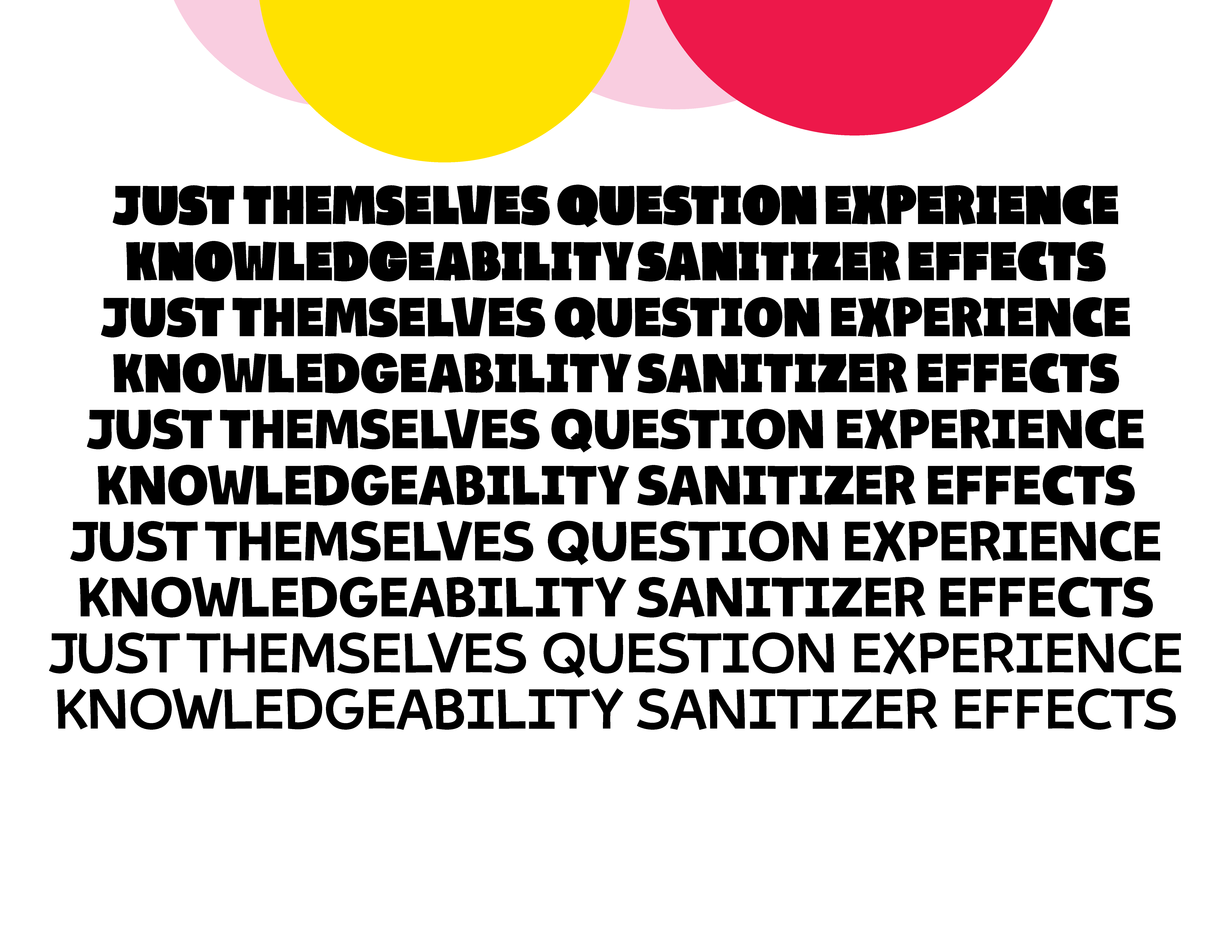
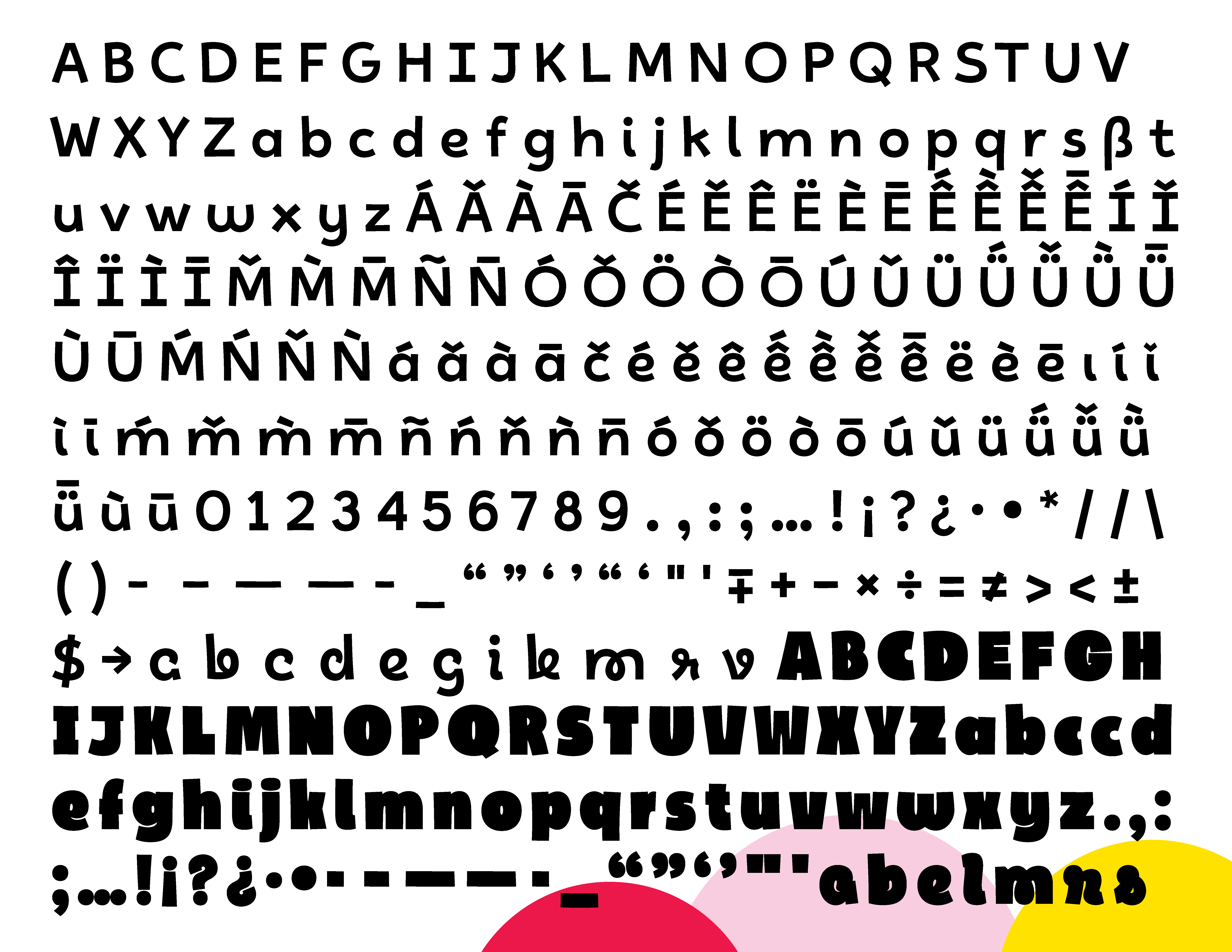
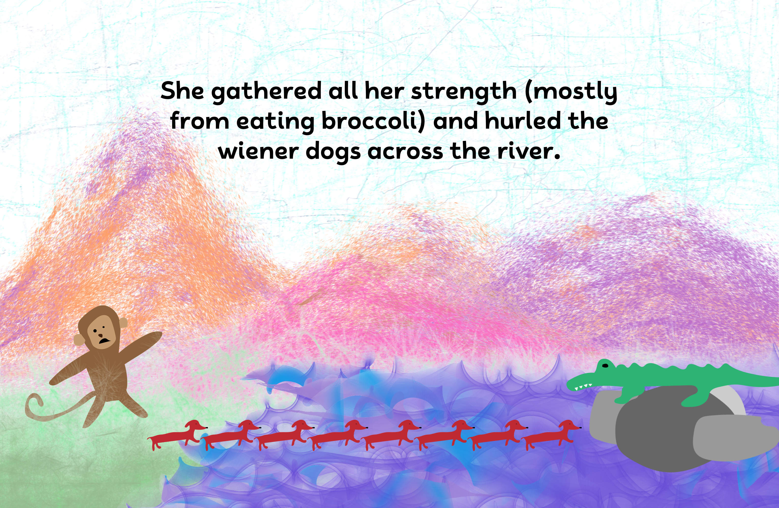
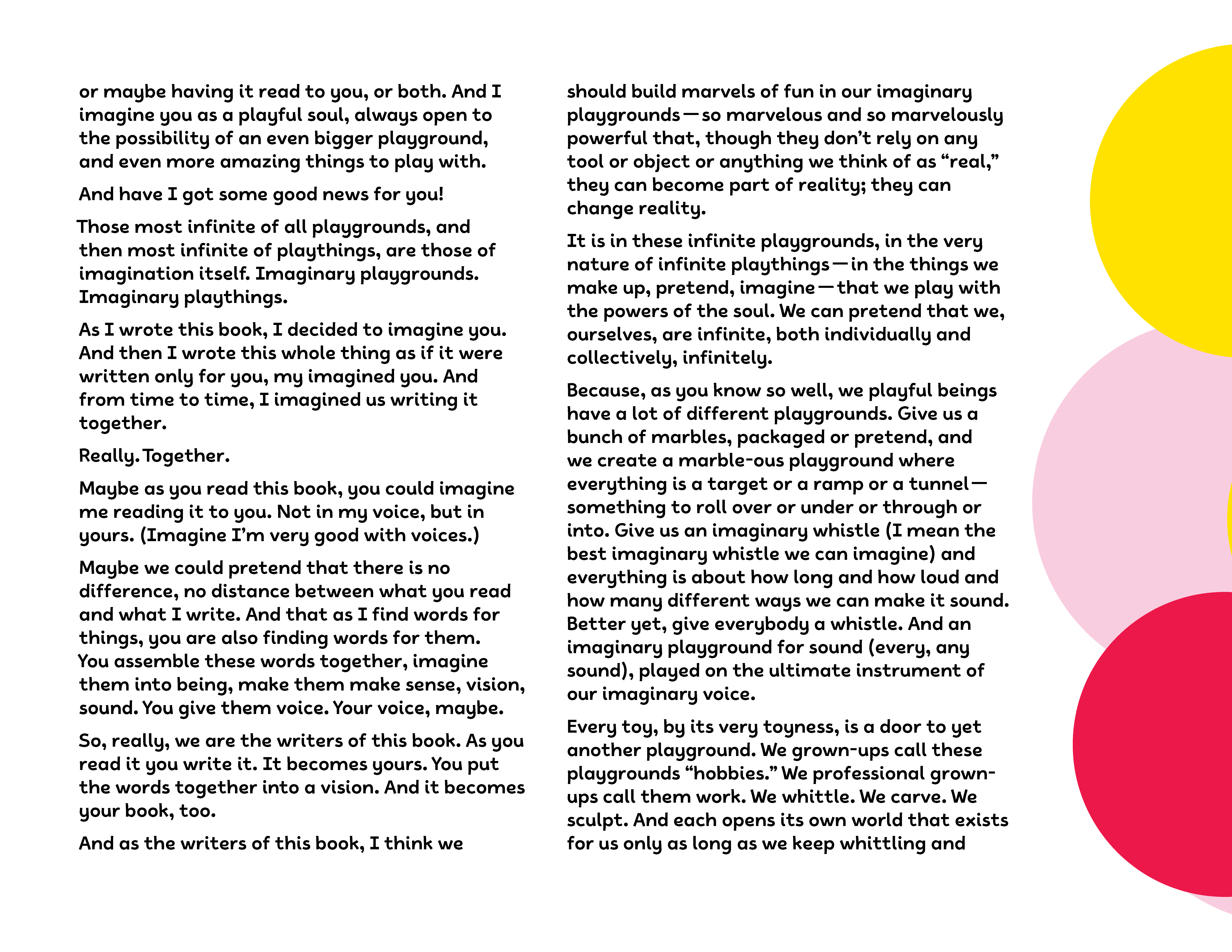
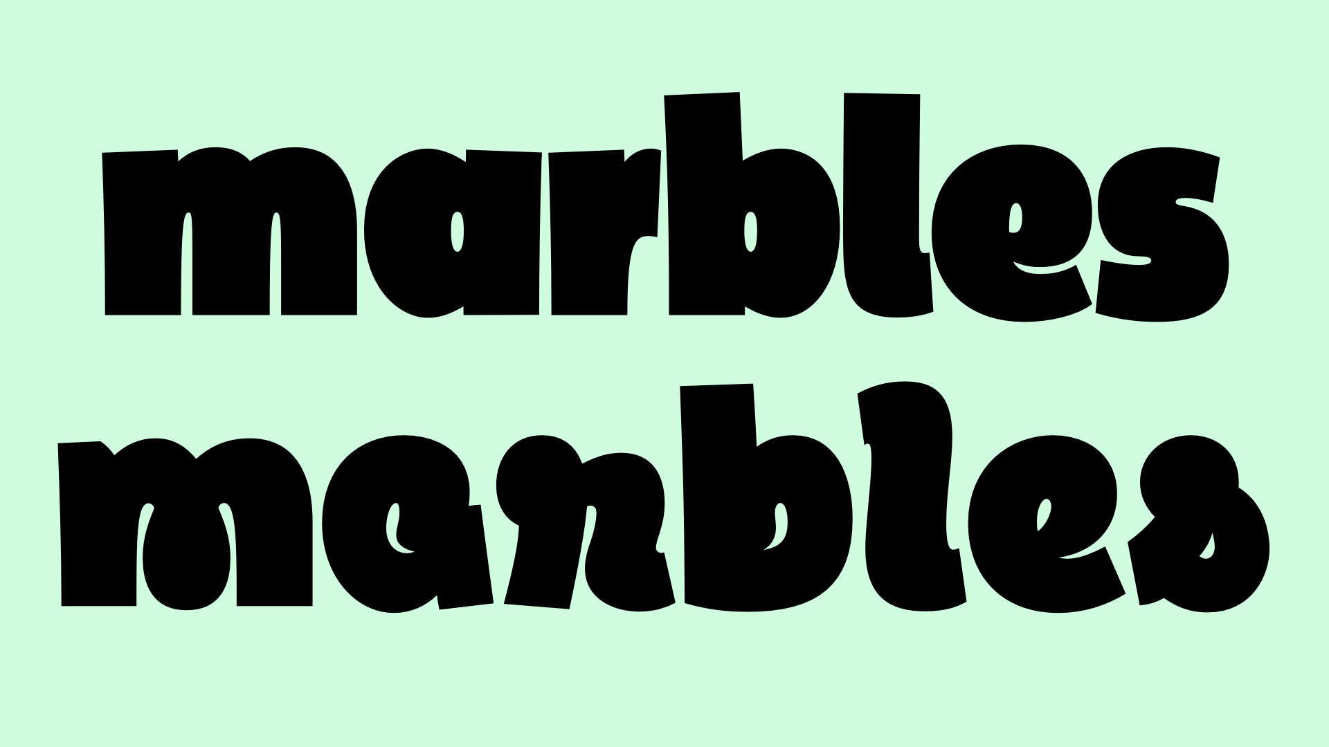
Inspired by childhood homework assignments that felt more approachable when set in Comic Sans, Marbles brings levity to any subject taking itself too seriously. Off-kilter strokes create a lively texture while maintaining clarity even at small sizes. The heaviest weights squeeze counters into fun-sized morsels that gently swirl in the script letters. No matter how arcane the subject, Marbles renders it with the same grinning charm.
Designing the Typeface
When I was growing up, what typeface a worksheet was set in affected how excited about it I was. Calibri was okay, Times New Roman was never a good sign, and Comic Sans was pretty great. Or at least as good as it would get for homework.
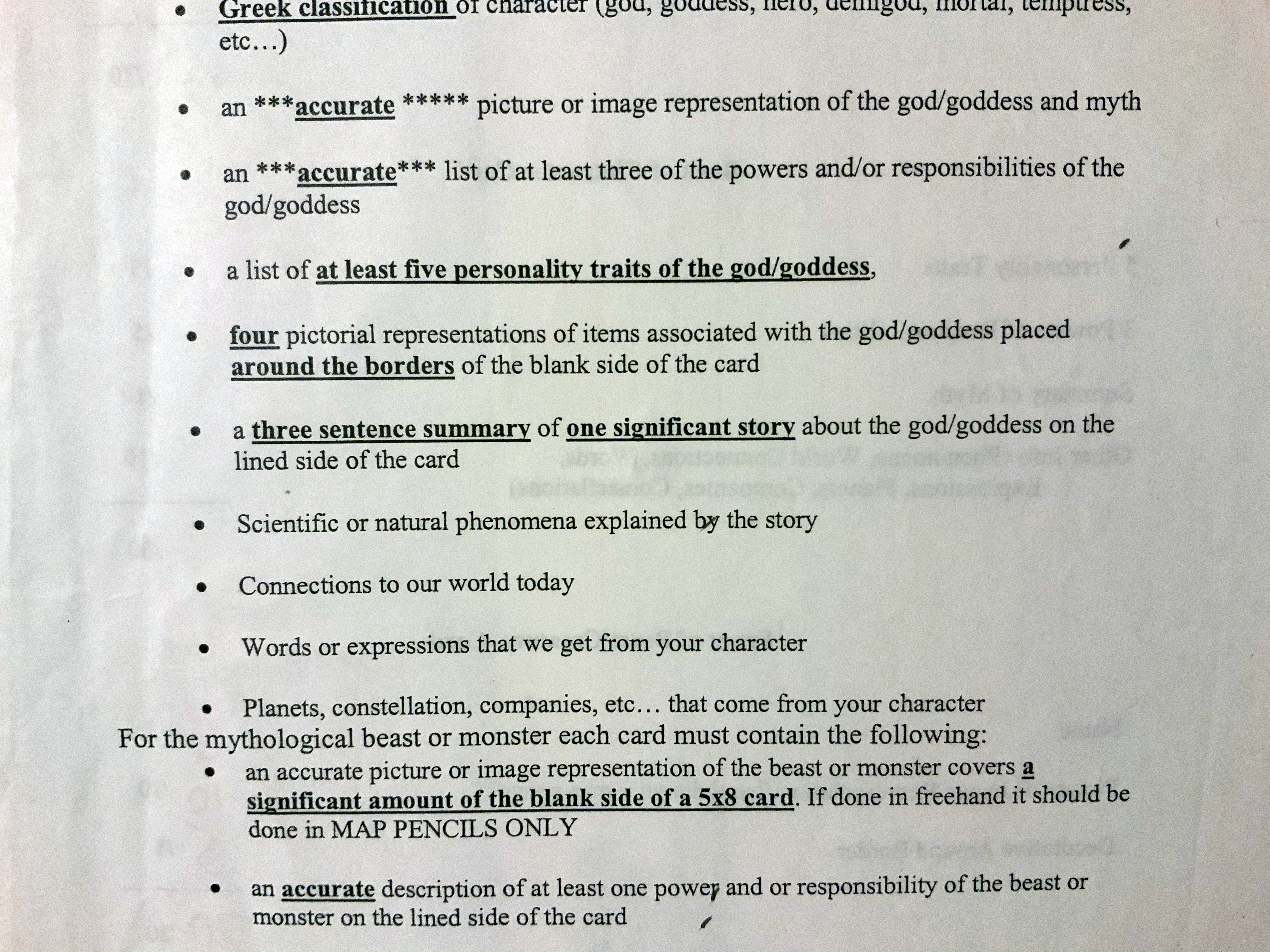
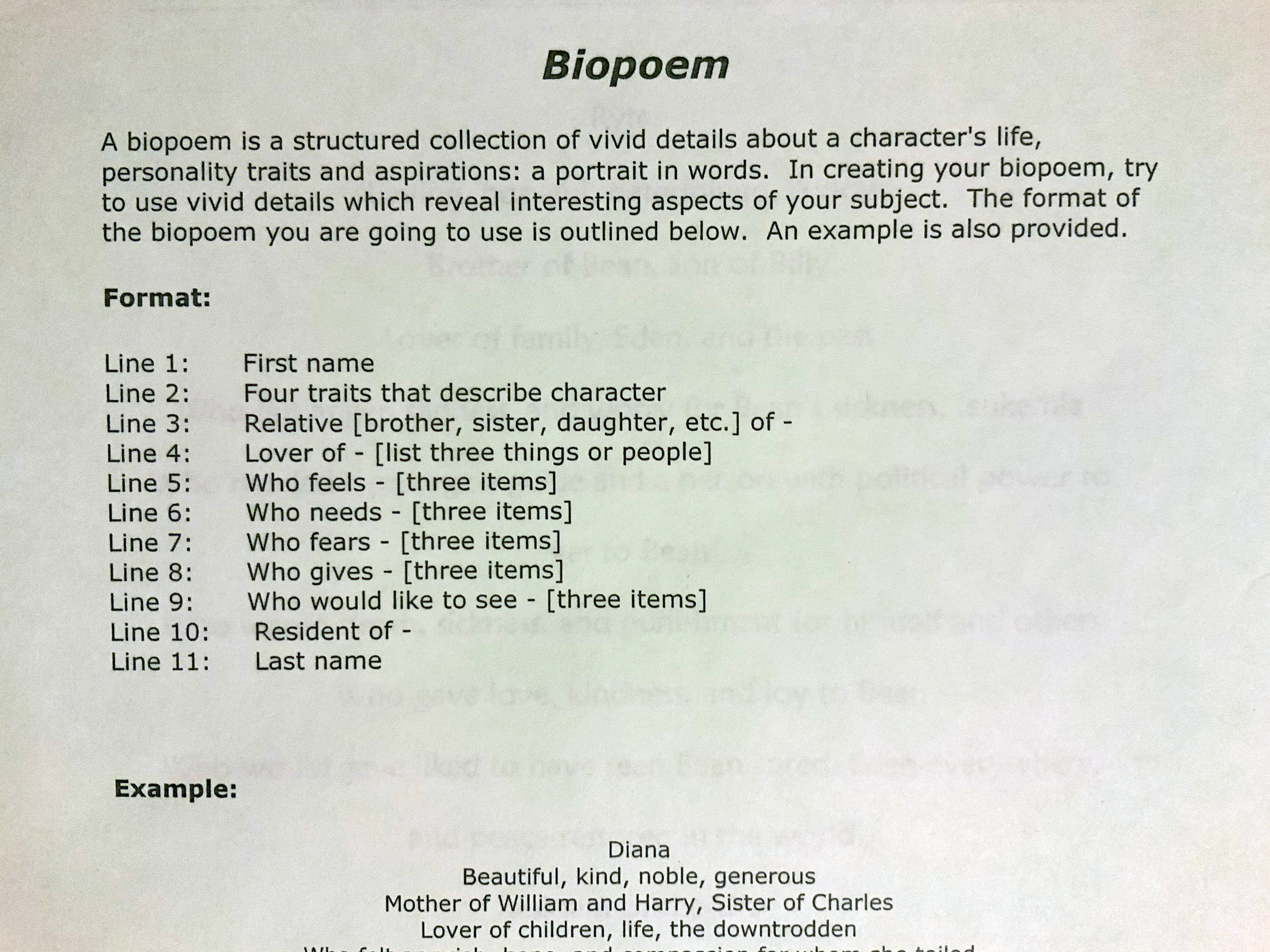
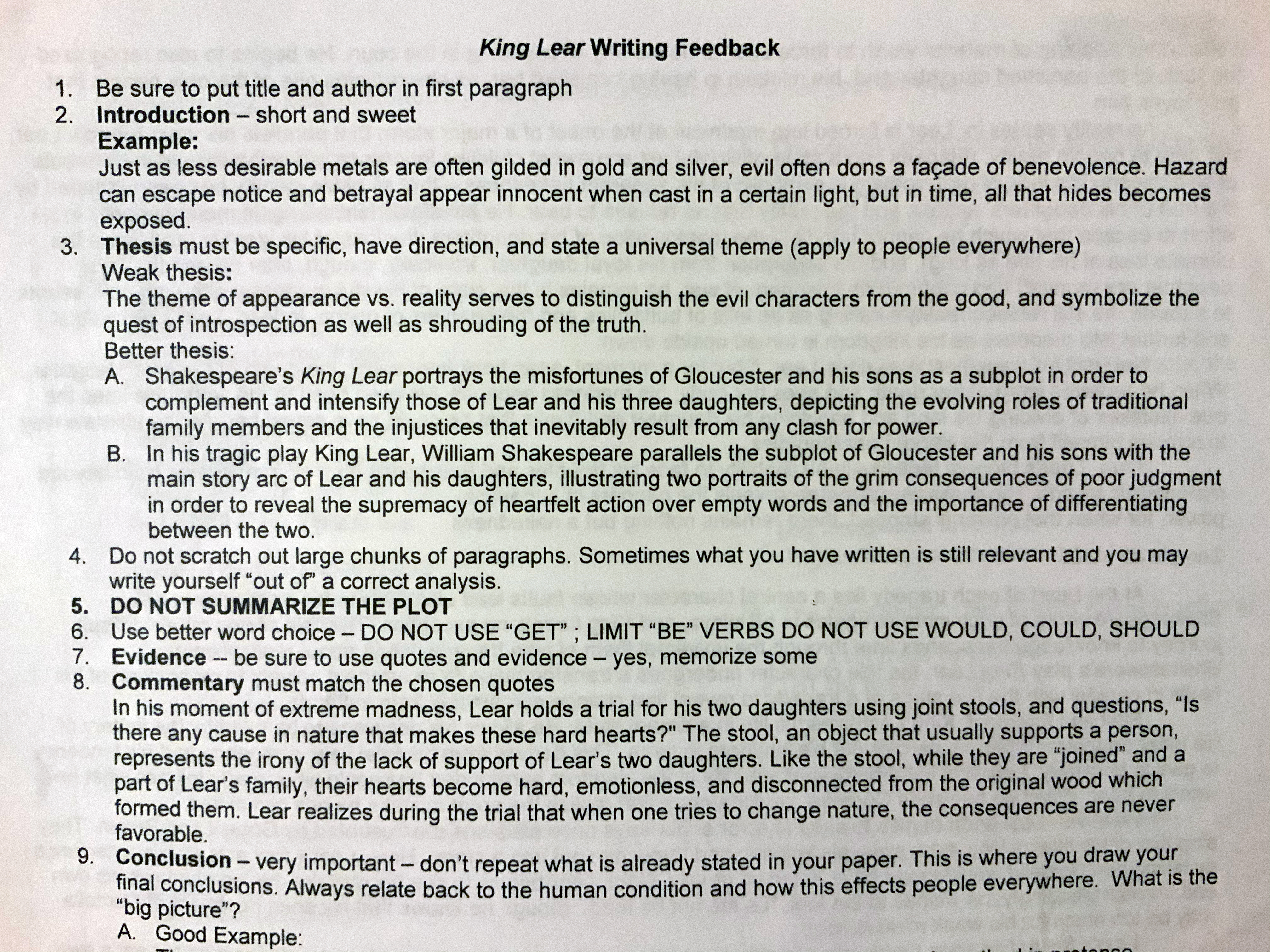
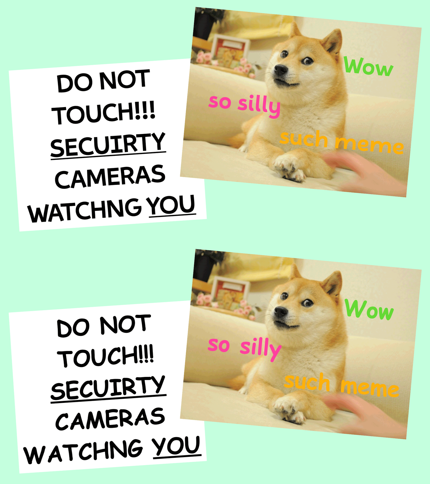
Most people don’t find Comic Sans threatening, and many enjoy it in playful memes. I tried to capture that whimsical vibe with Marbles.
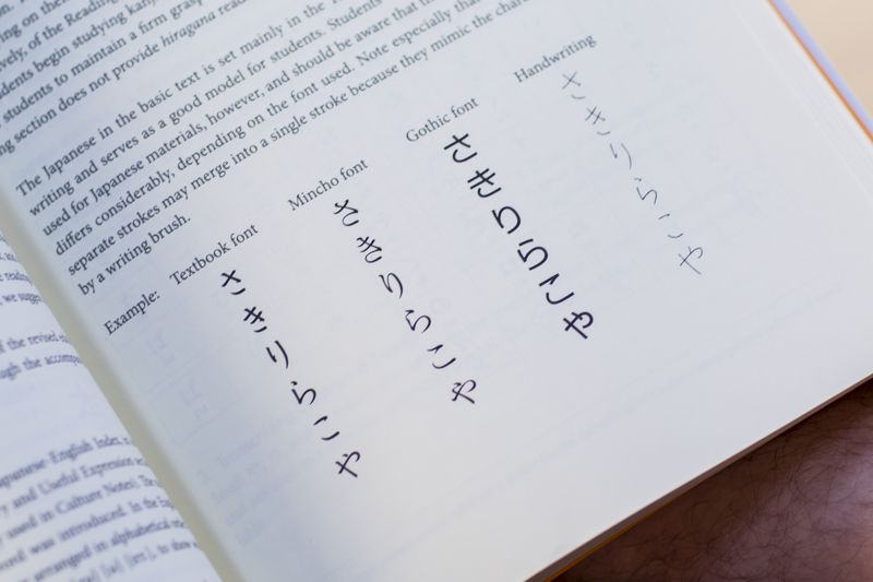
Marbles is also influenced by the East Asian Gothic style. Before I had an aesthetic target, I was trying to create a monospaced typeface by reimagining Latin script written top-to-bottom rather than left-to-right. The East Asian Gothic forms my Japanese handwriting is modeled after naturally came through. I eventually ditched the fictional letterforms, but the kana-like strokes are still noticeable.
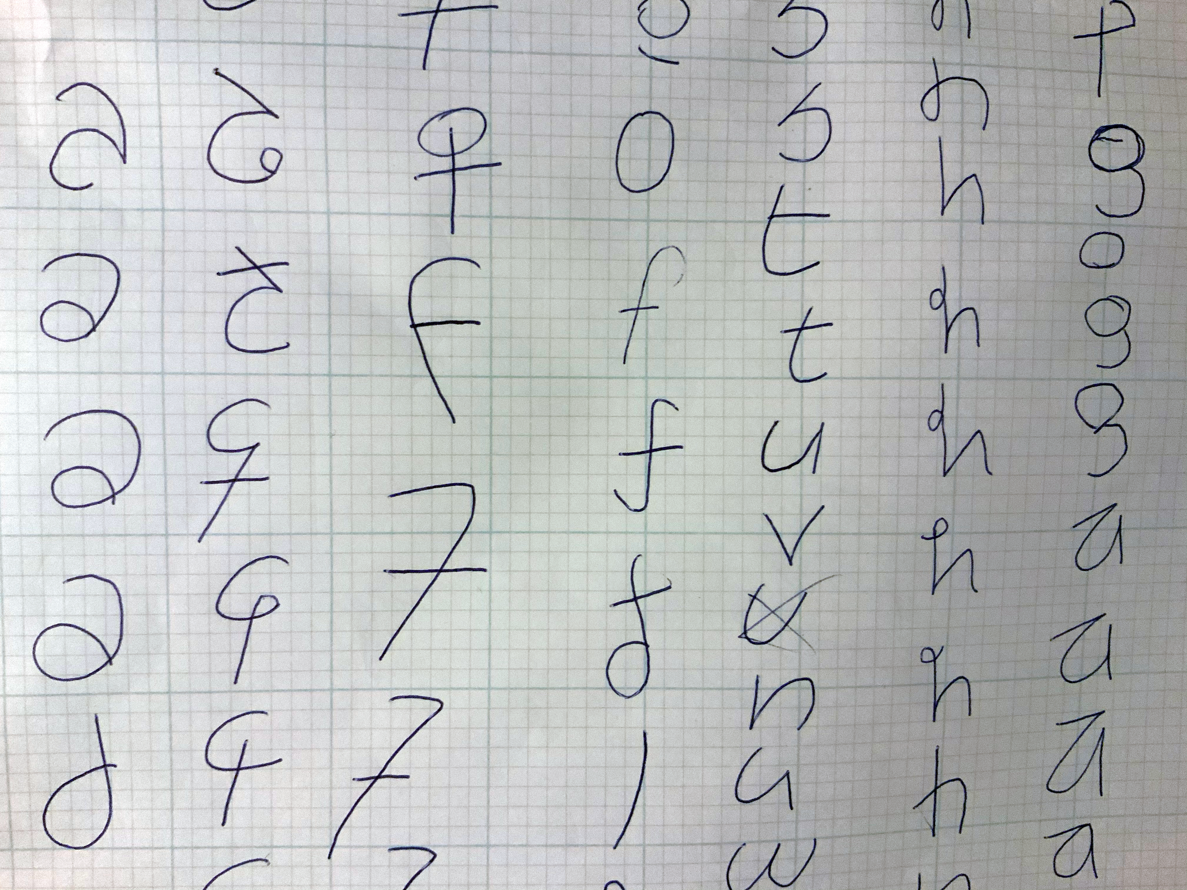
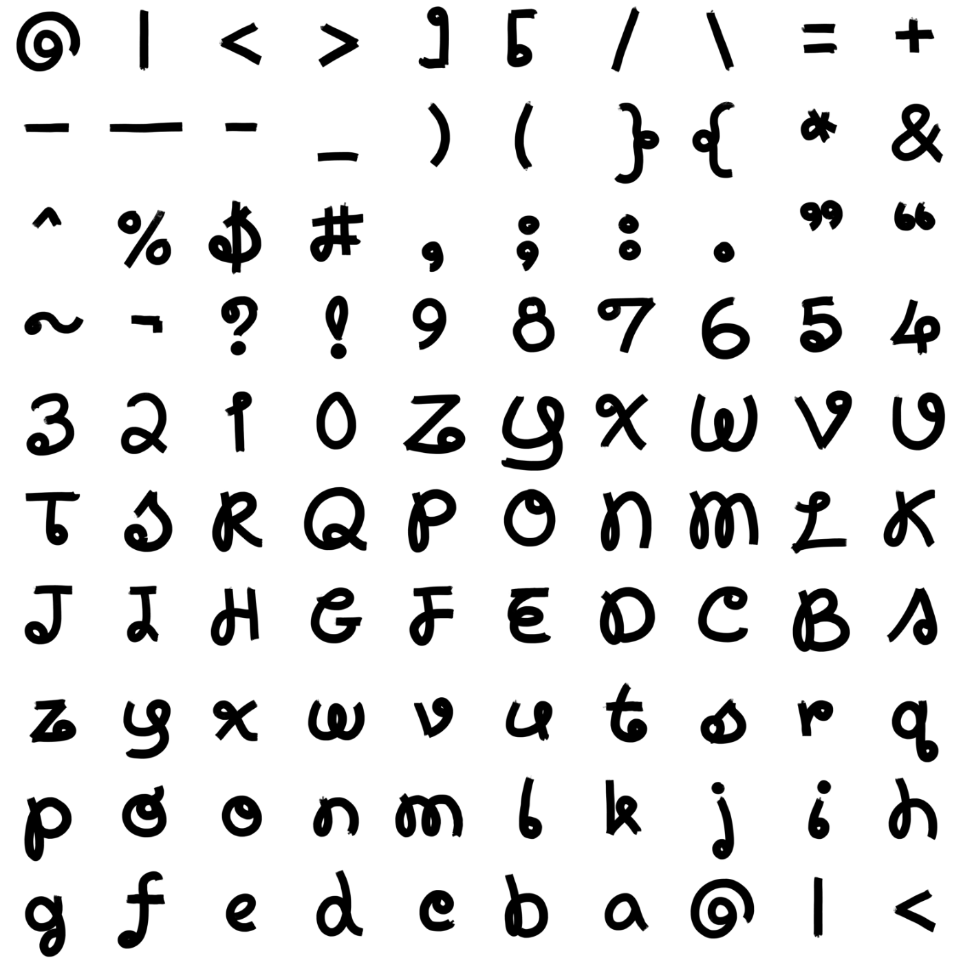
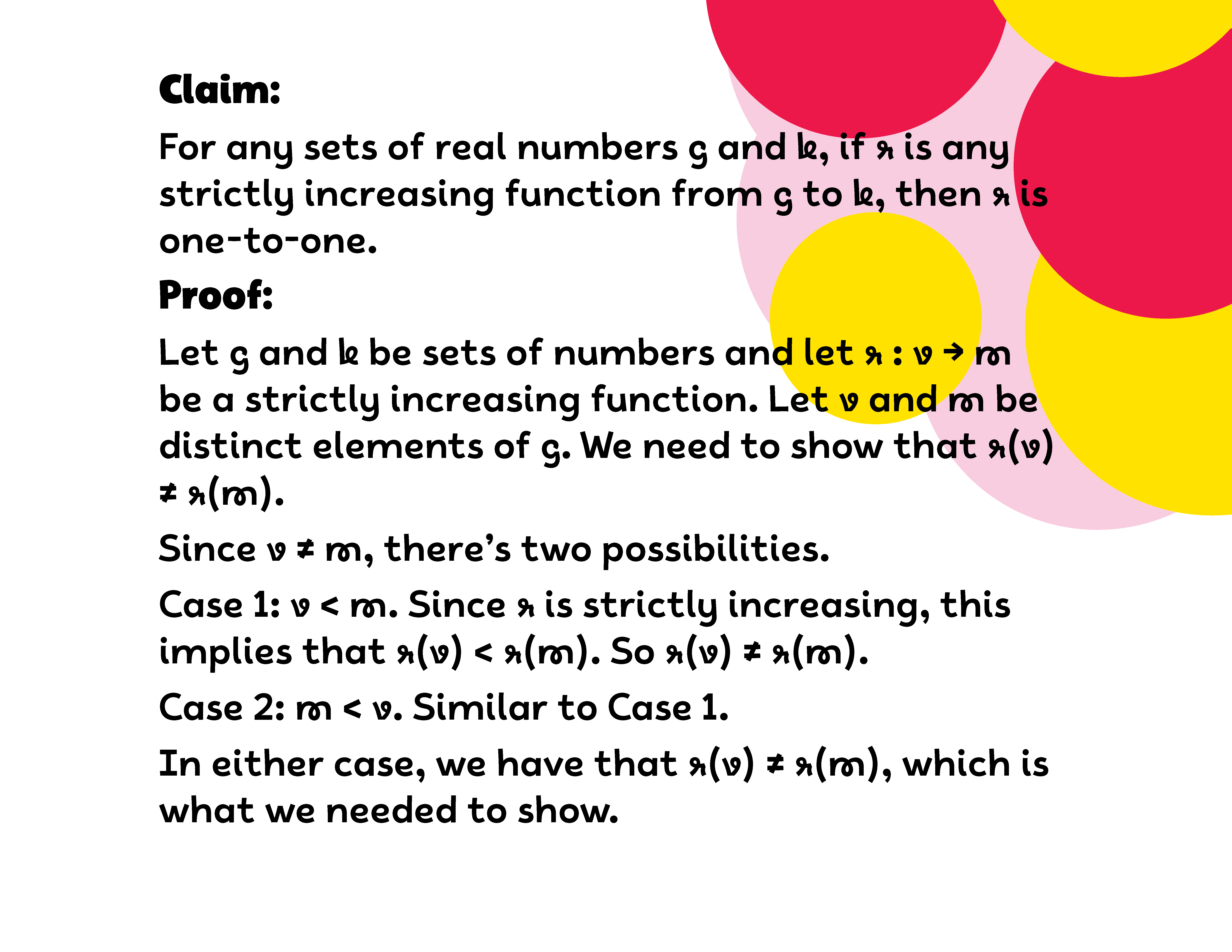
As a learning tool, I wanted to have extensive character support, but also wanted every character be distinguishable from others when handwritten. This proved to be difficult when designing script letters used in math. I had to be careful not to add entry or exit strokes that could be confused for hook diacritics. At the same time, I also tried to avoid having the exact same ductus as the roman letters.
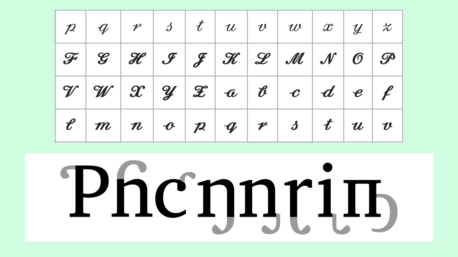
I gathered many teaching scripts from Europe, the United States, and Vietnam to reference as possible solutions. However, many of these letters were too proper and ornate for the approachable vibe I was going for. After lots of experimentation, I found that detaching strokes kept them from being too fancy.
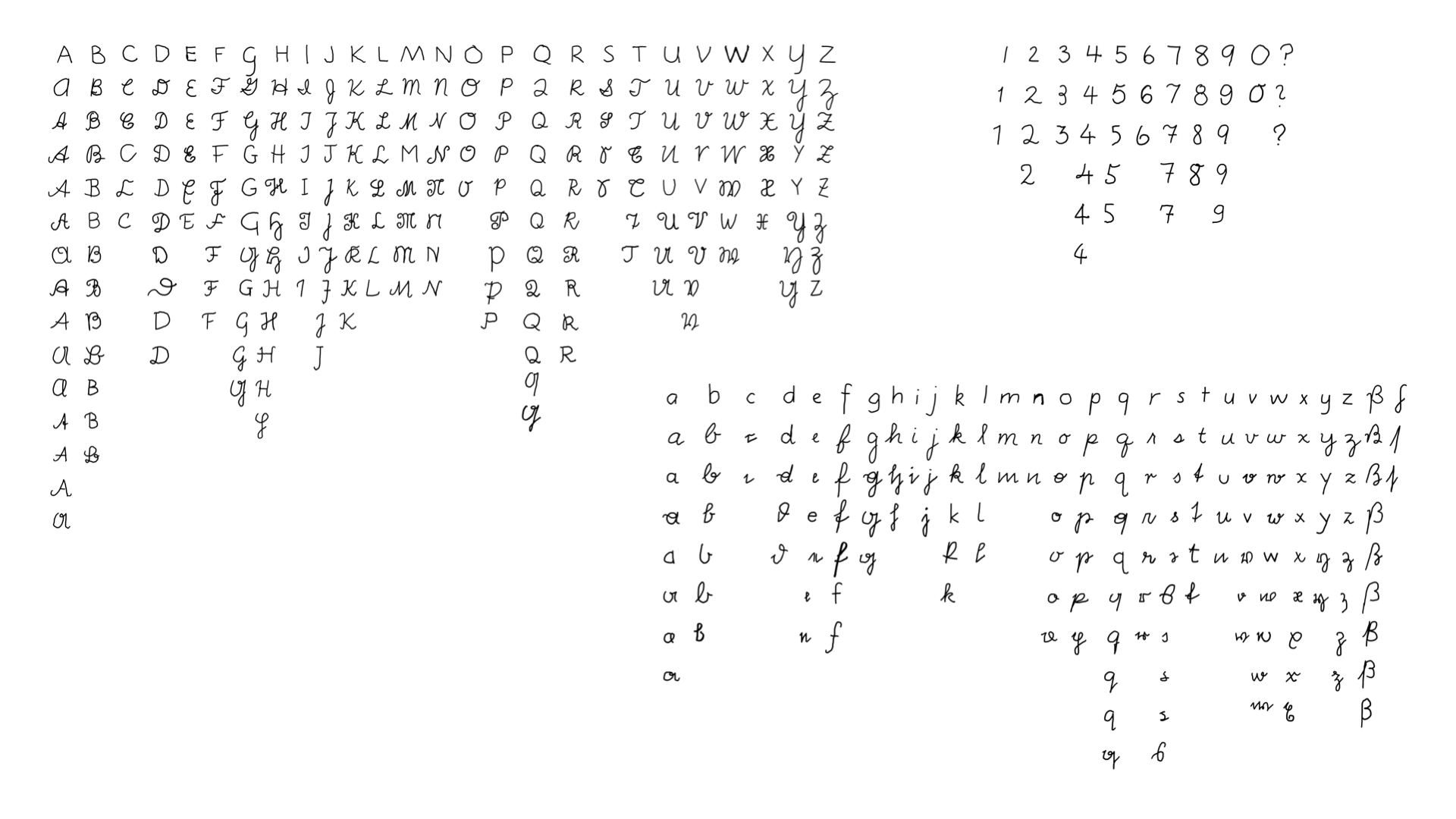
Once it was time to add extreme weight to the glyphs, it became clear that my novel script letters were going to need further unorthodox treatment. I landed on squishing the counters into swirling tadpole shapes. It’s one part crazy, one part creamy, and kinda reminds me of the patterns you might find in marbles.
Styles & Weights
