Panoptikon
designed by Nurullah Gokdogan
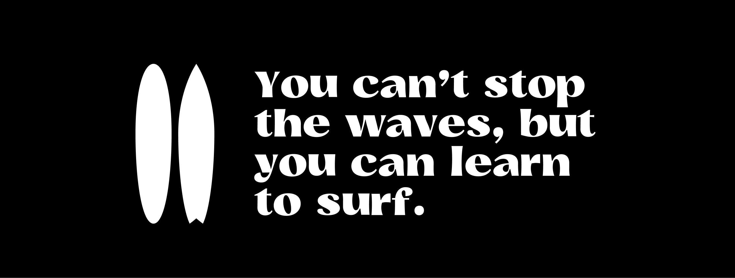
One person can make waves.
Try editing the text!
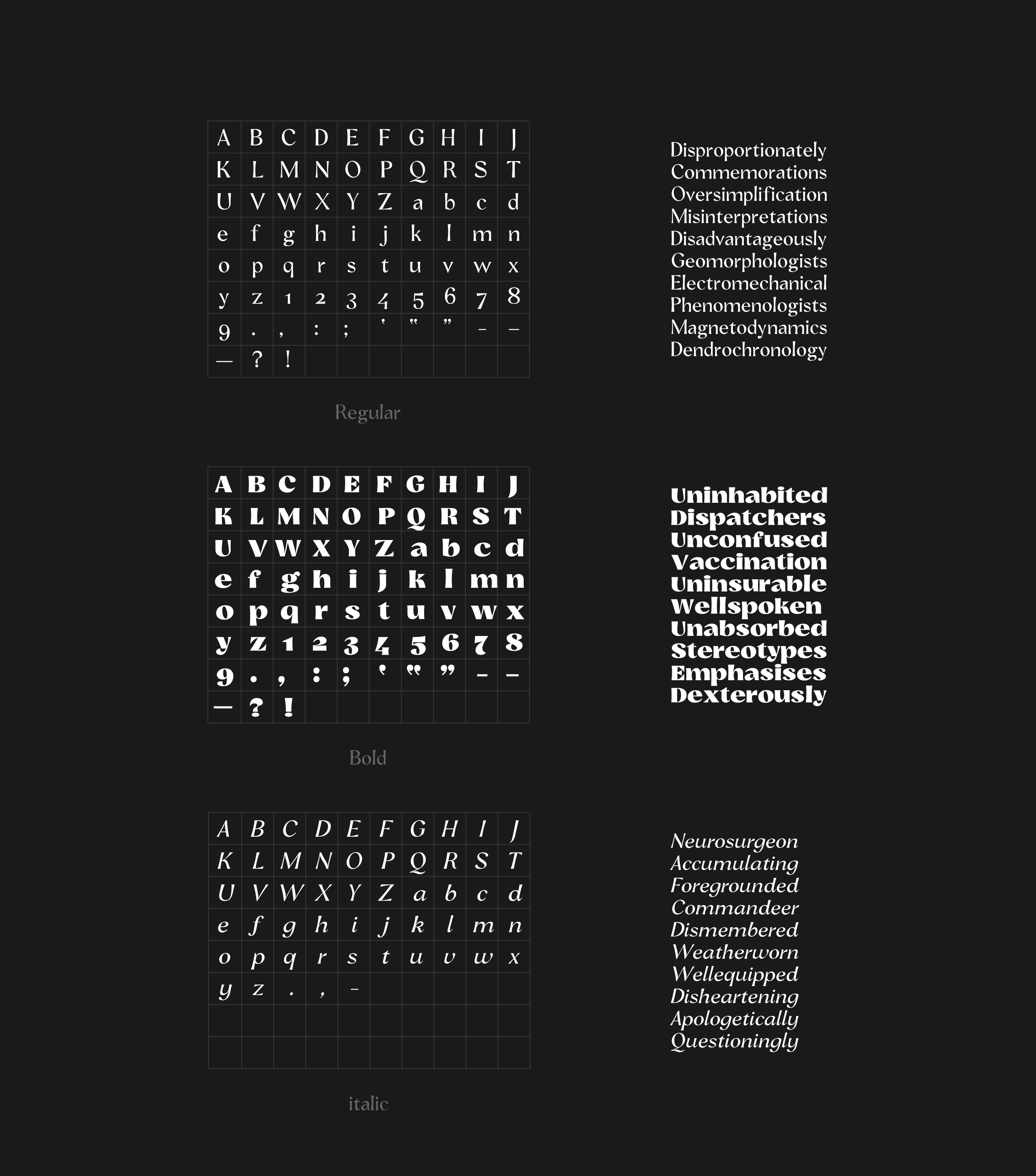
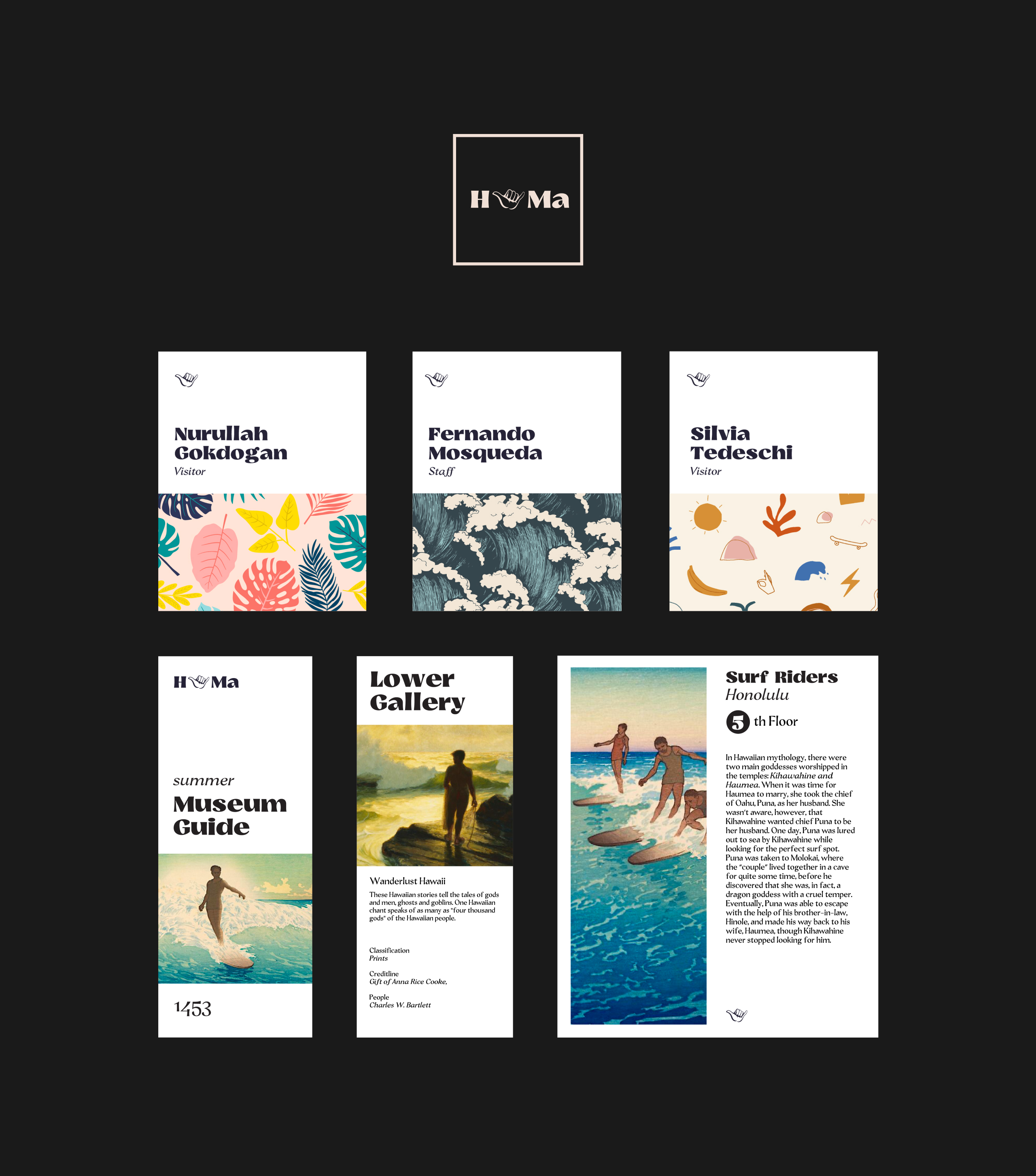
Panoptikon is a sans serif display typeface that comes in 3 styles: bold, regular and italic. The typeface is high-contrast and fun to use for museum exhibitions. If you want a playful and authoritative display face, Panoptikon will satisfy your needs for the exhibition. Concave stems give it a dynamic form. Geometric sans serif fonts are everywhere and art needs some fun and playful headlines and descriptions.

Since I come from an art background, I can empathize with how art is one of the bold ways to express feelings. I know how hard it is to create art, which needs a grounded messenger for your message. Panoptikon is delightful and bold enough to carry your message’s echoes.
Bold should be bold. I designed a bold weight, audacious enough. The regular weight is a great choice for the artworks’ descriptions. This typeface takes a stand for artists.

Story of the Name
The word panopticon derives from the Greek word for “all seeing” – panoptes. Panopticon is a prison concept created by Jeremy Bentham. The plan of the prison is a circular building that has a tower in the middle where a single security guard is always observing the prison. Prisoners are not able to tell when they are being watched or from where.
This made me wonder, “Why don’t we apply this concept to museums metaphorically or even in real life?” Metaphorically, art is around type. Type is like a proper representative for the artwork. It helps us to observe them and learn about them. In real life, we could build a museum in a circular building, where all the artworks can be observed at once from a tower and improve our consciousness of being surrounded by art at any moment outside of the museum as well.

