Bounce Haus
designed by Lizzy Ha
All happy families are alike; each unhappy family is unhappy in its own way.
Try editing the text!

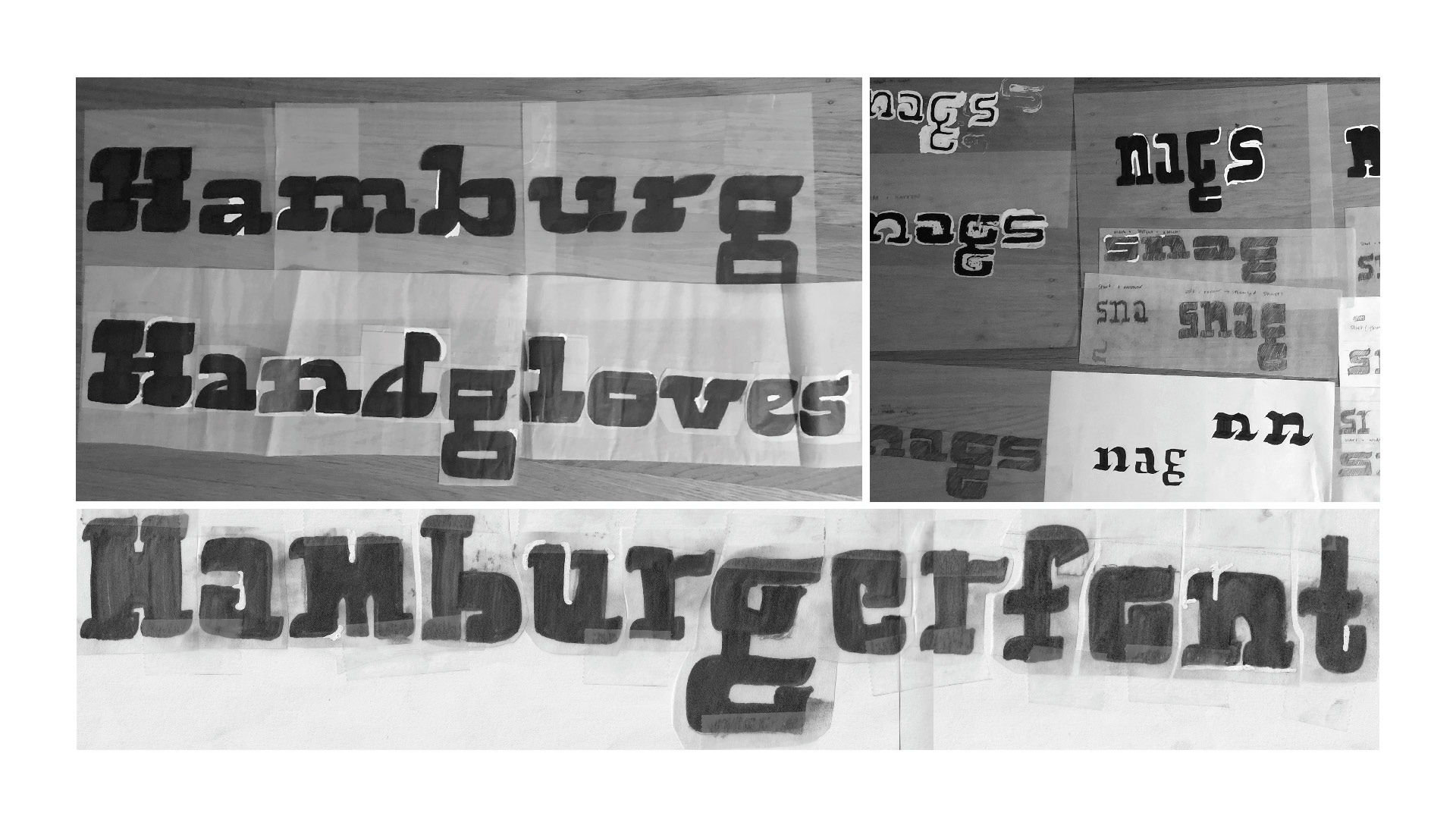
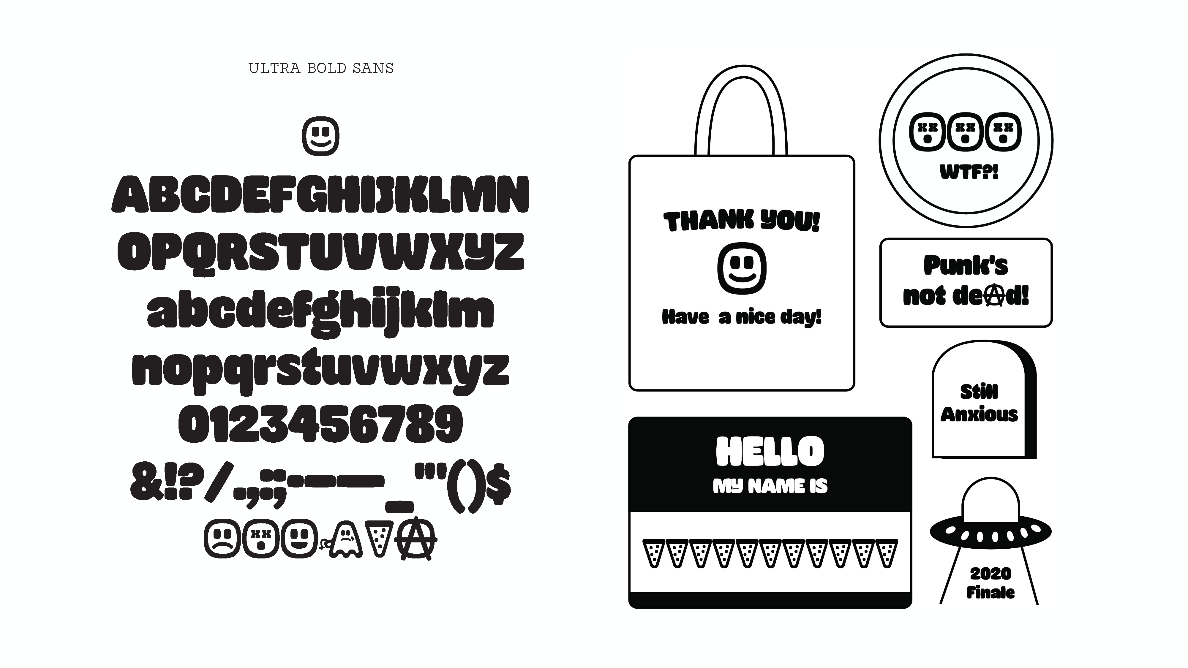
My journey with Bounce Haus started in term two with bold letters. I didn’t realize how hard ultra bold letters would be. I struggled with balancing the positive and negative shapes.
During break, I continued to add letters as well as numbers. I also went back into exploration mode, re-examining my serif sizes. At the end of term two I removed the ‘d’ serif, because it just didn’t fit. It was suggested that perhaps my serifs were too big so I explored smaller ones with white out. This didn’t spark joy so I kept the ‘d’ the same for most of the break.
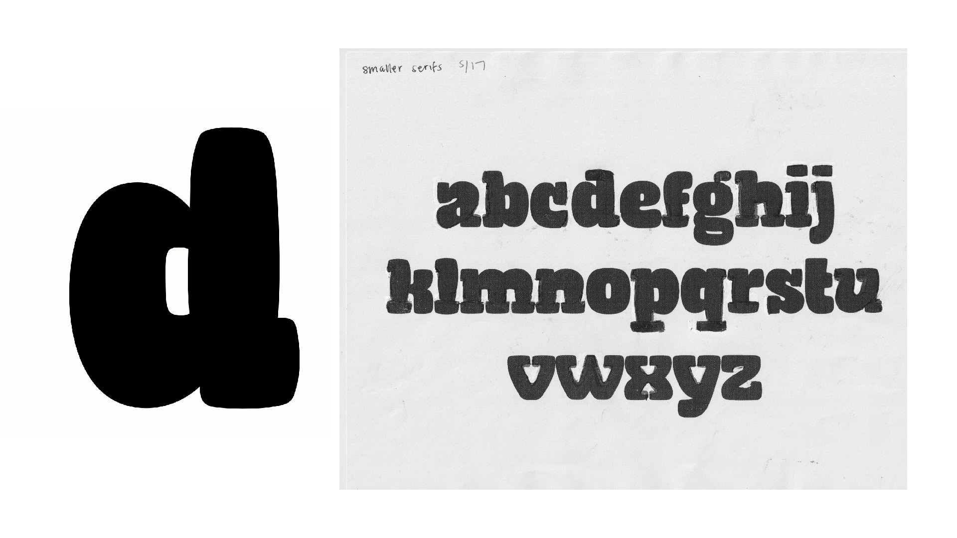
But then, I was binge watching Friday Night Lights and saw a ‘d’ with a reverse serif, dare I do the same?

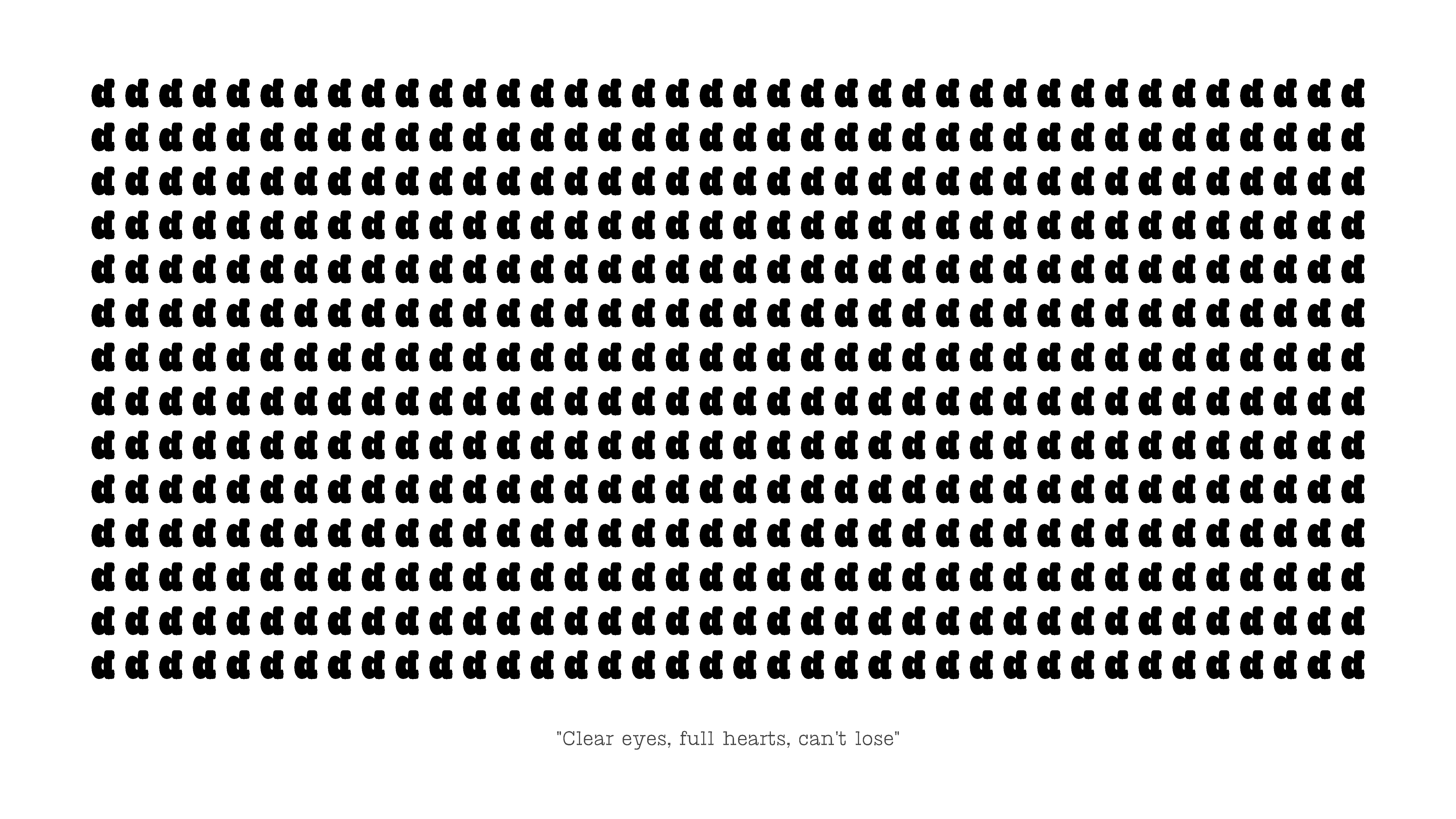
With clear eyes and a full heart, I didn’t think I could lose so I totally went for it:
By term 3 we started to see the rise of Bounce Haus. To figure out what my family should be, I looked at deflated objects for inspiration. I also carved out the existing letters on my iPad and drew over them with brushes.
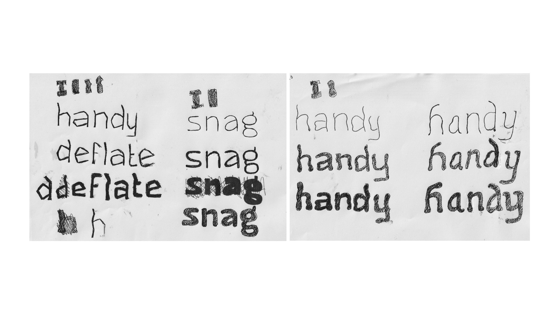
I ultimately settled on a sans and text version. With the sans I had the same problems I did with the serifs, which was balancing the negative and positive shapes.
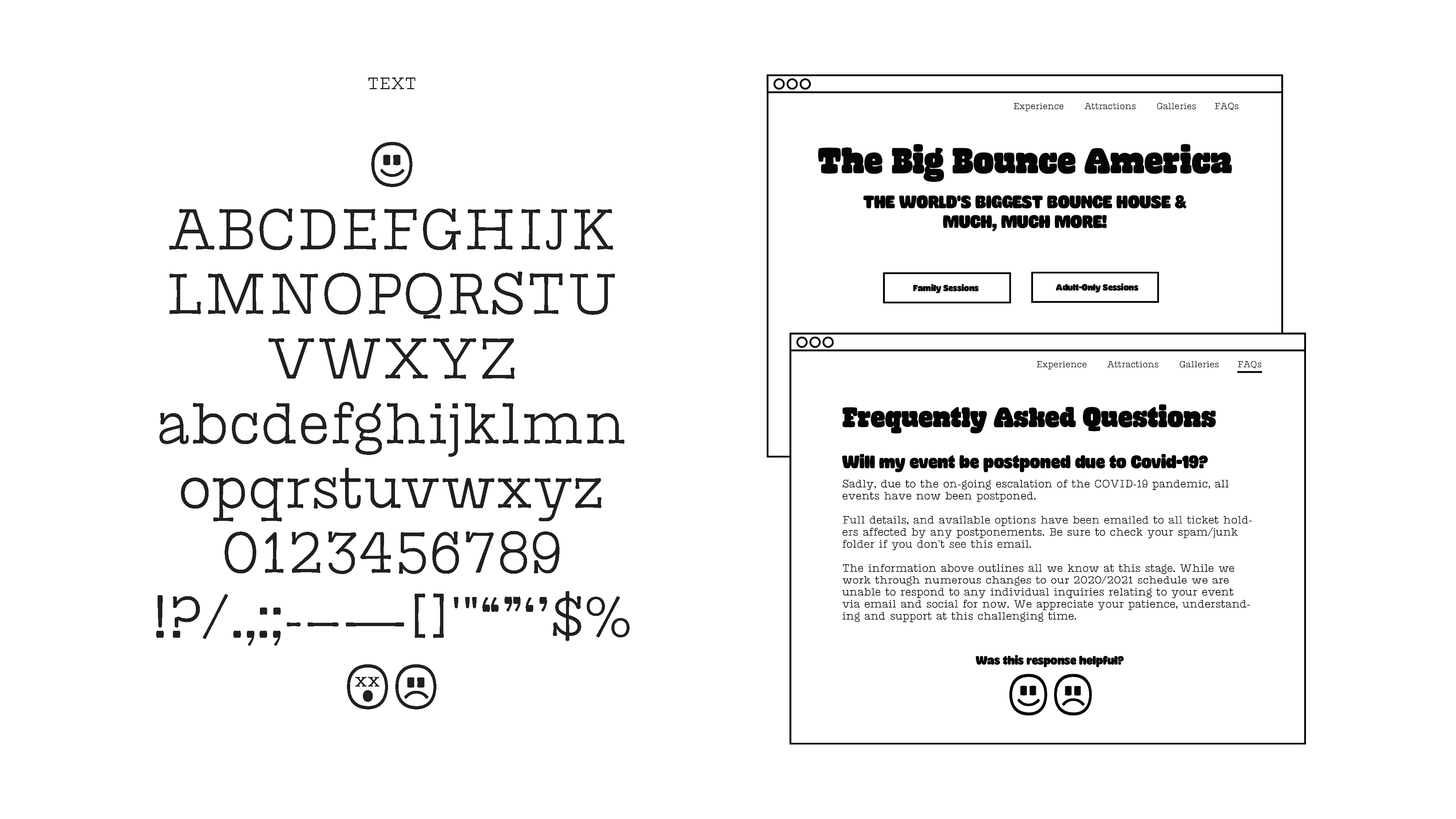
For text I had to figure out how similar, or not, letters should look in relation to the bold counterpart.

I also returned back to the ‘d’. I received feedback that the reversed serif made it look like a completely different letter. In the end I reduced the bowl size and this allowed for a chunky serif to fit.

And here we are at the end of term three. I hope to return to Bounce Haus one day, especially term three work.

Designed by Lizzy Ha
