Gramercy
designed by Lauren Jochum
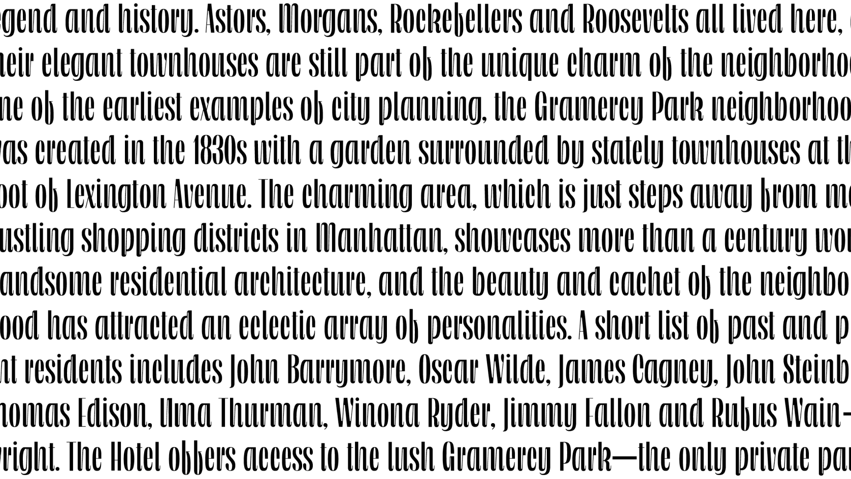
Gramercy is a high contrast, high drama typeface, with both display and text styles. Wherever you decide to use it, expect it to turn heads.
Try editing the text!
A high contrast, high drama typeface, with both display and text styles. What should you use it for, you ask? You could use it to brand a hotel—say, the Gramercy Park Hotel. You could use it to design those “X MONTHS OLD” cards you put next to your baby and post on Instagram. Or maybe you should use Gramercy for the label on your homemade persimmon wine. I guarantee it will make it look top notch (but it won’t make it taste good). Oh! How about those name cards for your cousin’s wedding shower that you forgot you had to organize? Wherever you decide to use it, Gramercy will turn heads.


