Parlor
designed by Nathan Goldman
The word “Apizza” is the Campanian dialectal word that translates to “the pizza”.
Try editing the text!

Equally at home in your favorite childhood pizza parlor or an establishment with classier fare, Parlor pays homage to 1970s fast food culture, but beyond the surface its historical roots are in Victorian Era wood type specimens.


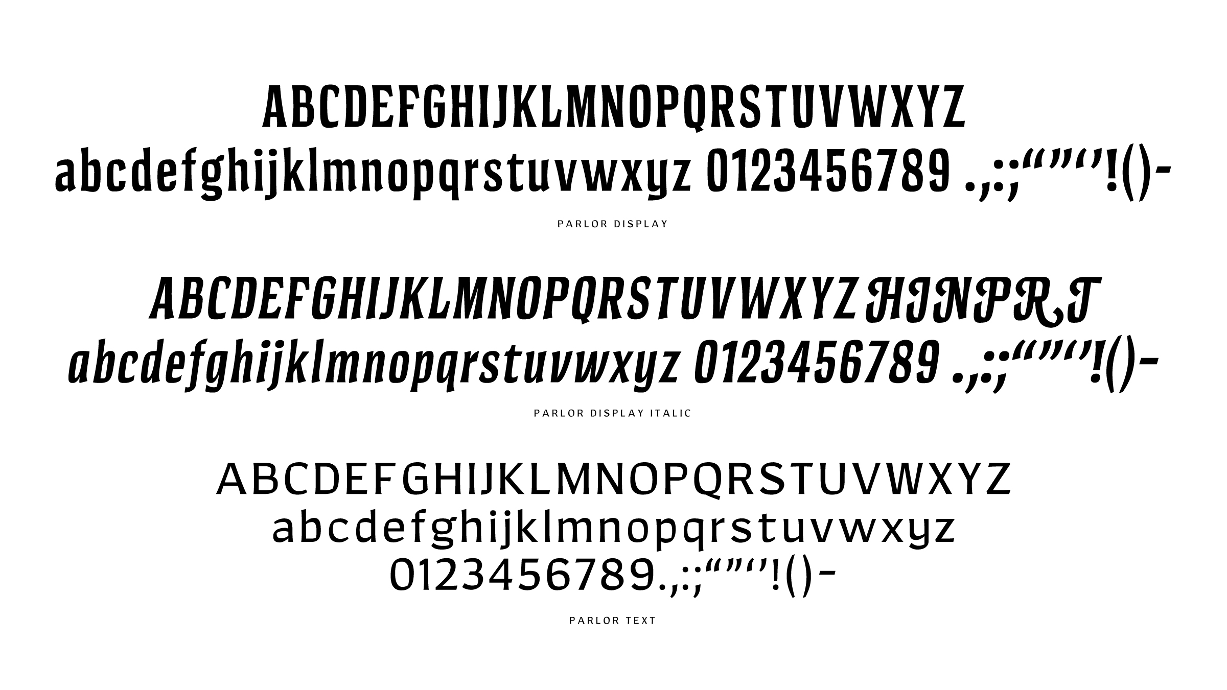
As for the construction of Parlor, one less expected attribute is its translation contrast, revealing a pen angle not as common among its peers. Parlor plays up some of its Victorian influences with its condensed display face and concave stems, while also leaning into its translation pen angle, like a more casual version of Lydian.

Parlor got its start as a bold condensed display face, with the display italic and text roman coming later. Intended for use in mostly large, bold applications, the italic serves to add emphasis and a bit more personality with its swash caps, while the text face is the workhorse of the family, bringing usability at small sizes.


Designed by Nathan Goldman