By Nora Warschewski · Ruhr Metropolis, Germany
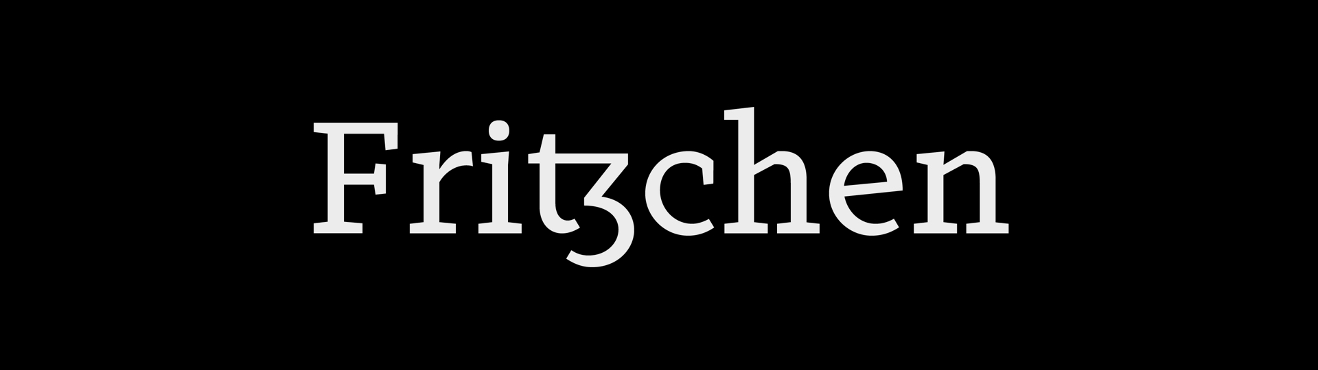
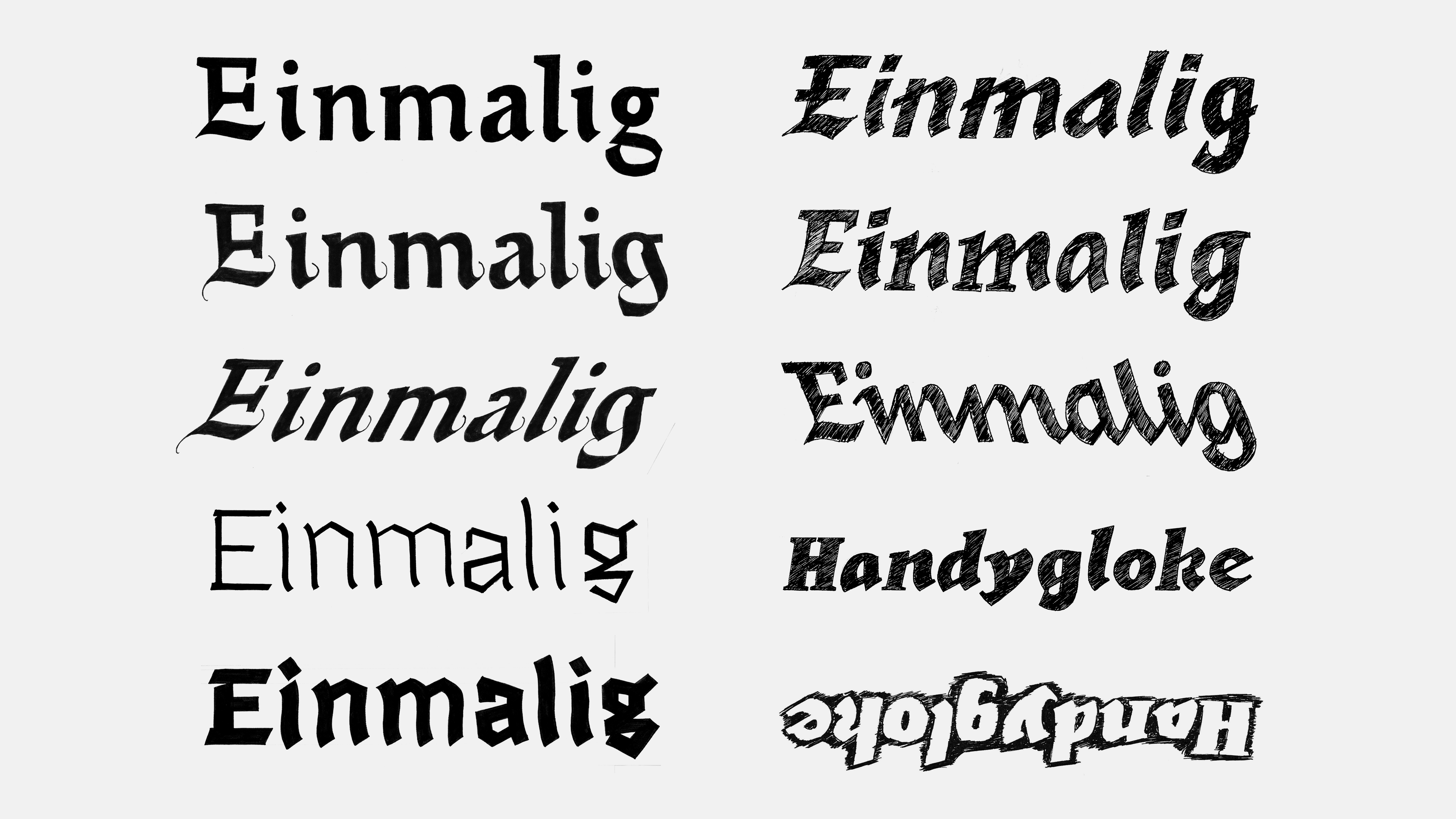
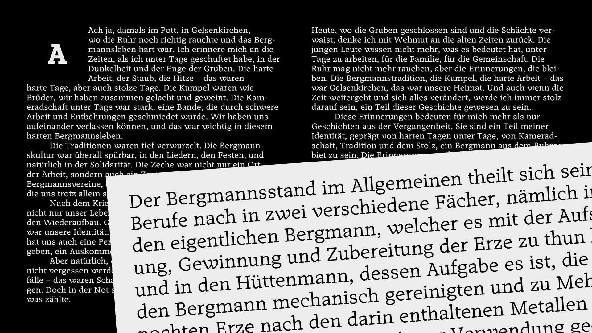
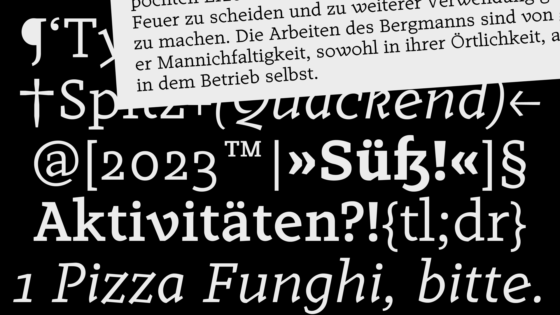
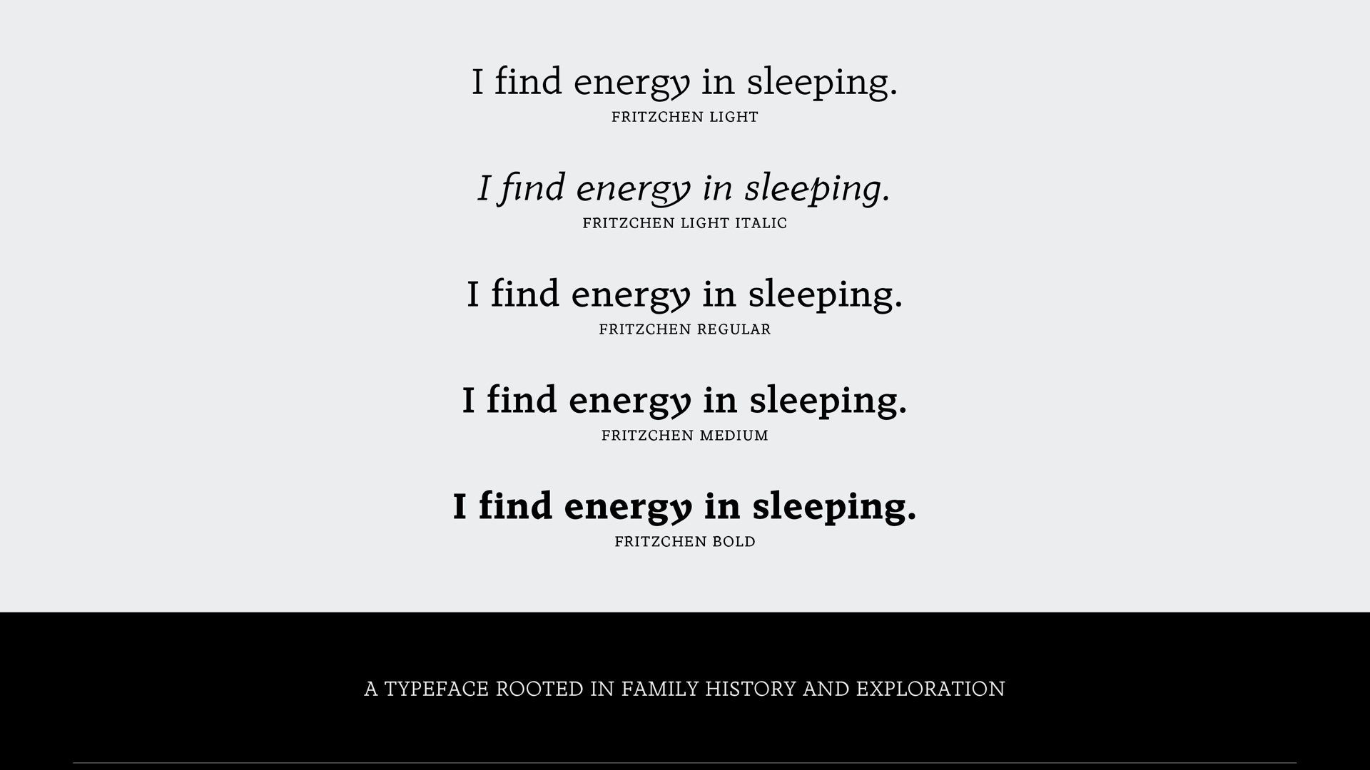
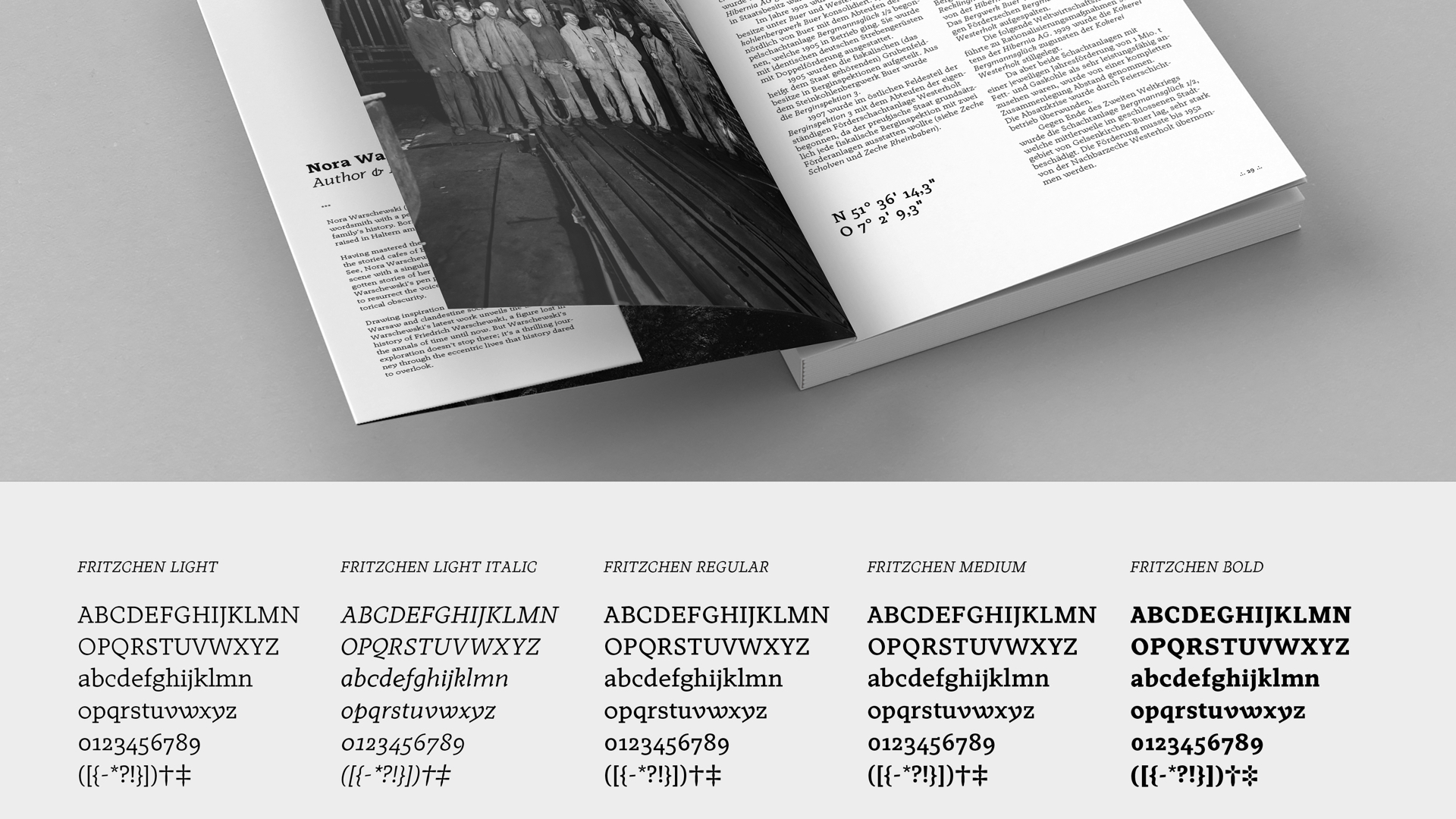
Fritzchen, a typeface project born from a non-linear process, was initially aimed at developing a contemporary blackletter-inspired typeface. The design process embraced the fluidity of exploration, resulting in a textface that blends historical elements into a typeface suitable for the contemporary world. The typeface captures the essence of the past while adapting to the demands of the present. It is a typeface that smells like an antique photo album, feels warm like the hug of an old friend, and looks like a distant memory.
Nora Warschewski is a designer and researcher from the Ruhr metropolis in Germany. She is interested in all sorts of topics around type, accessibility, and sustainability. In her free time, she loves reading books, gardening, playing Mario Kart and listening to her favourite podcasts.