
By Jo Malinis · Quezon City, Philippines
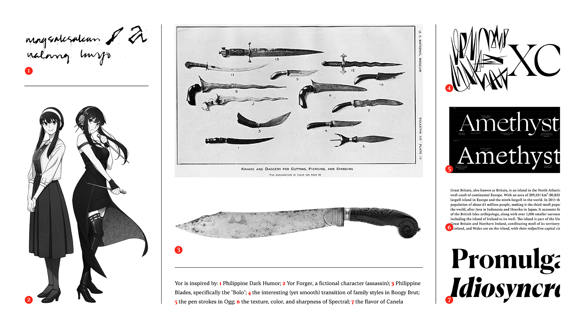
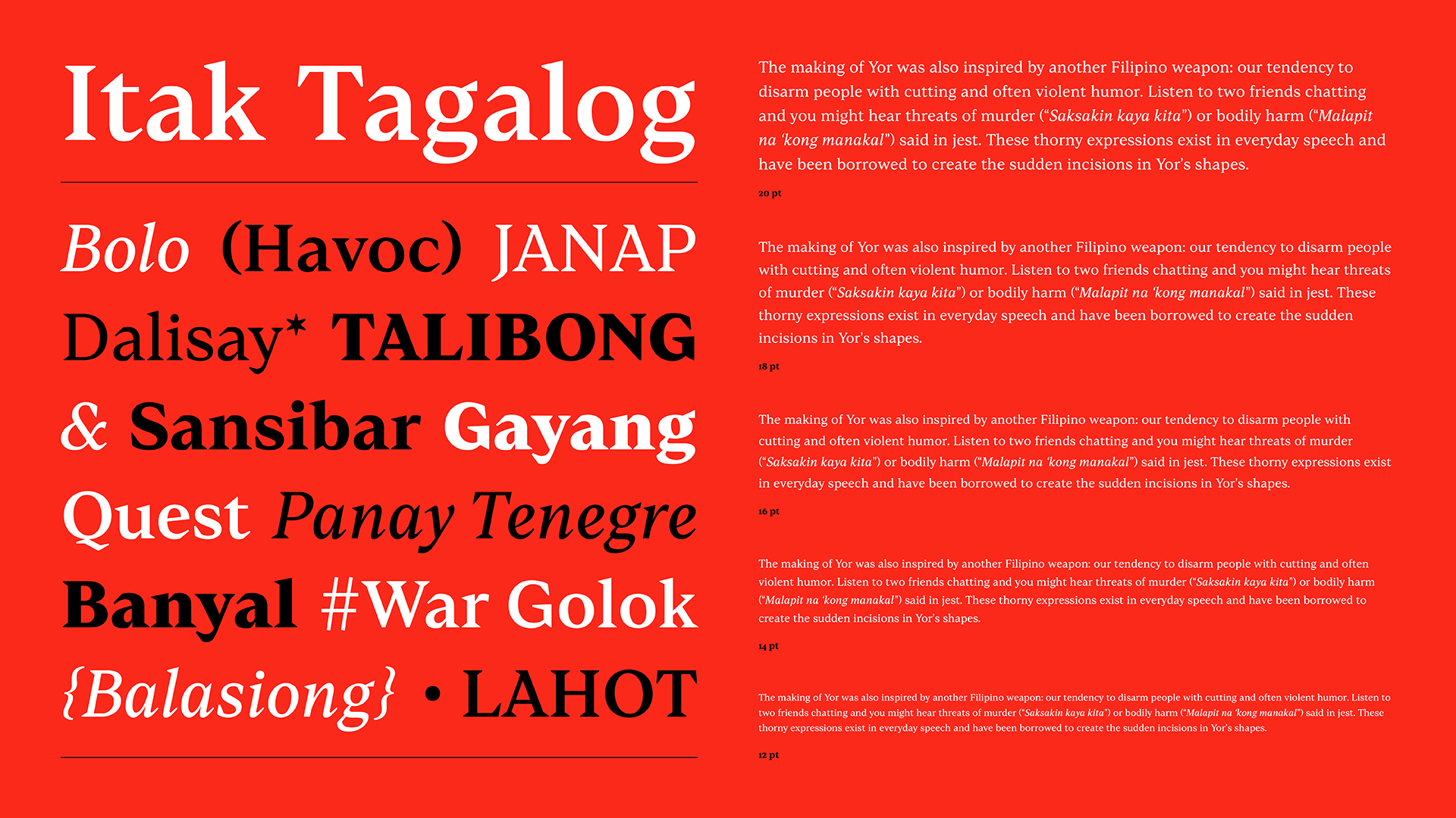
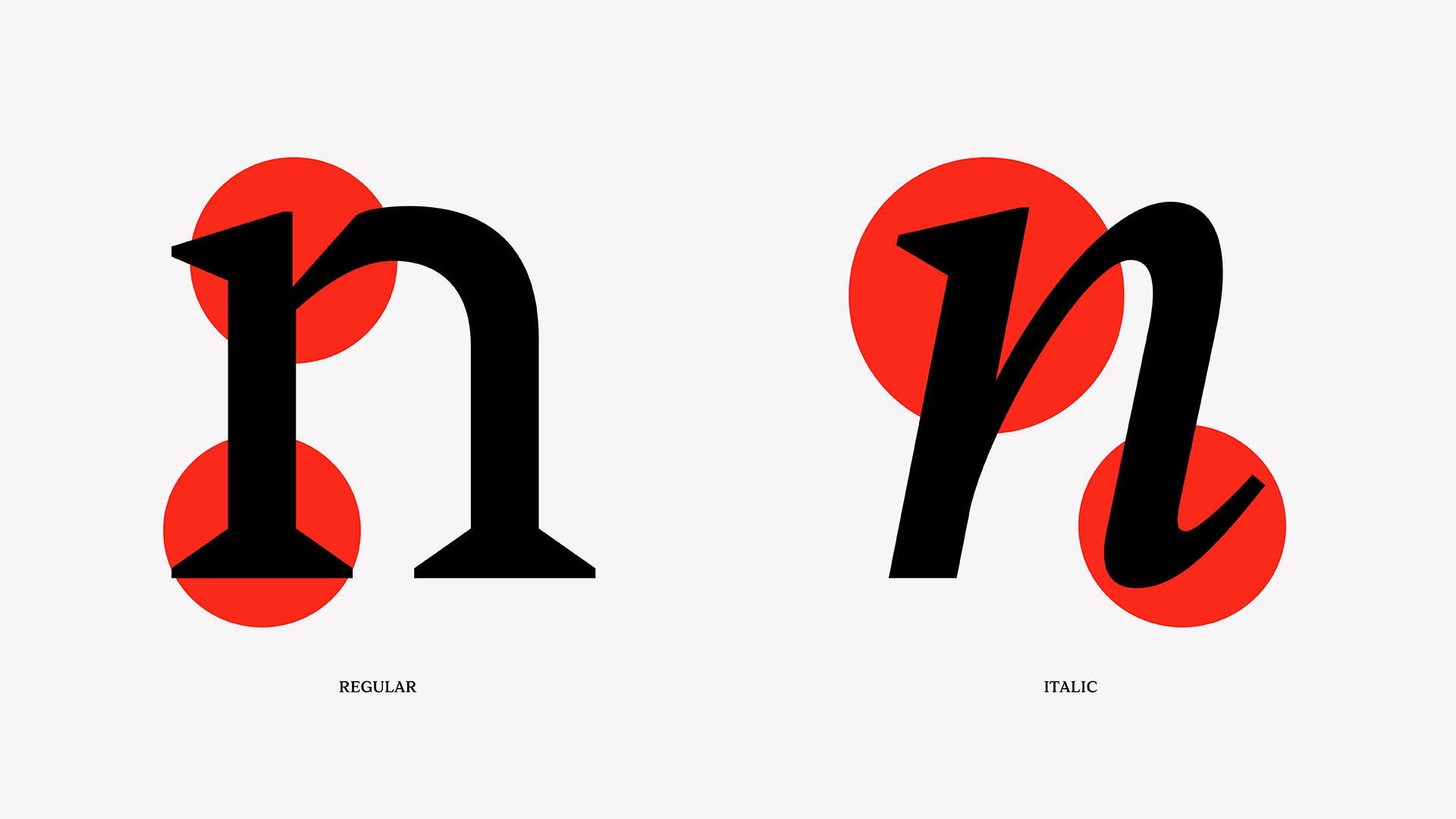
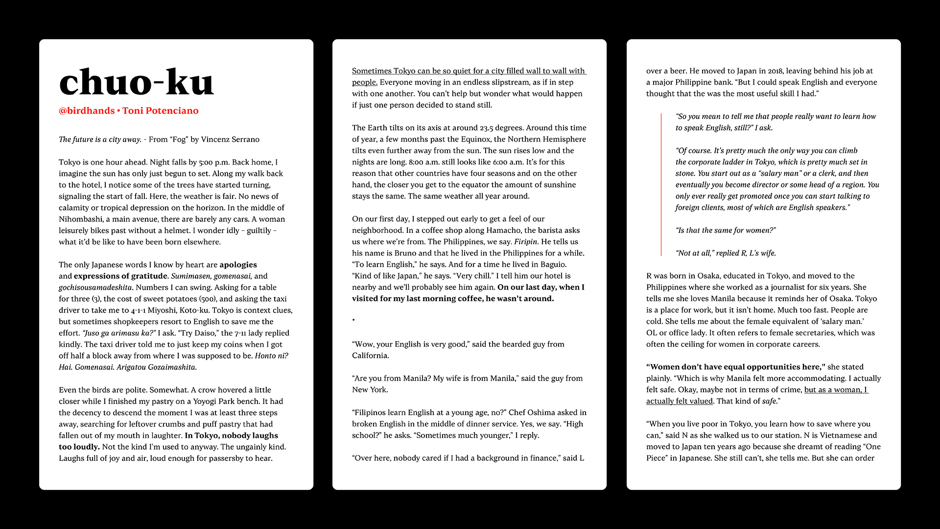
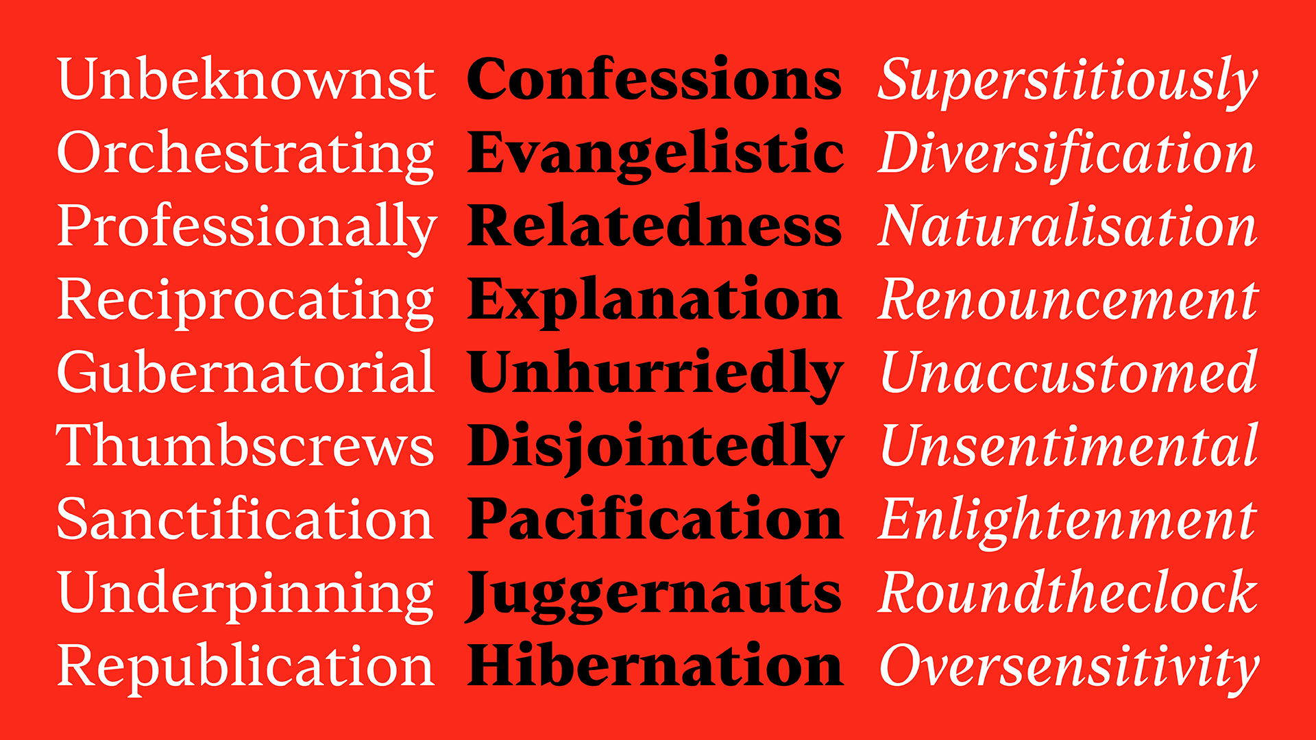
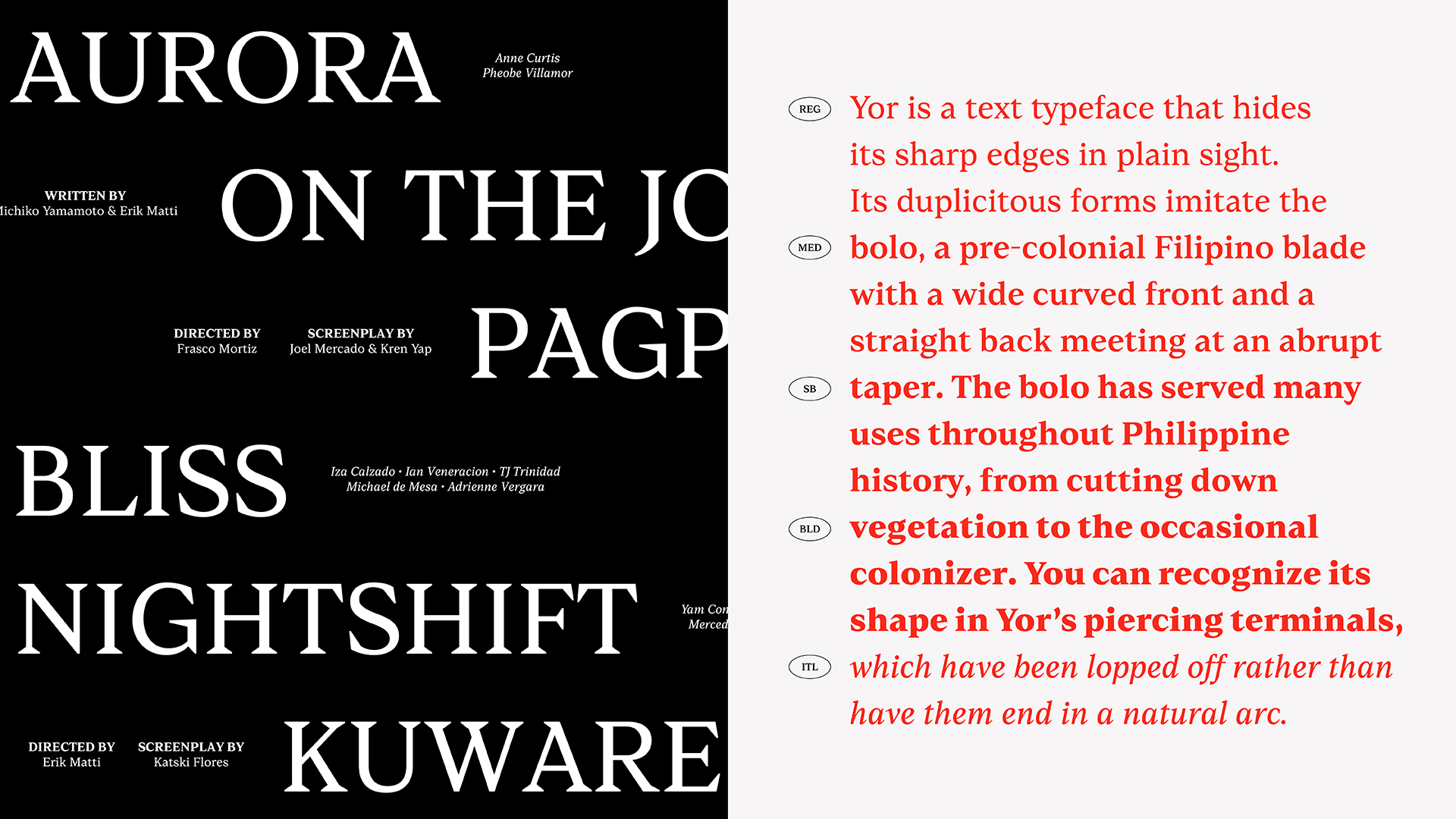
Yor is a text typeface that hides its sharp edges in plain sight. Its duplicitous forms imitate the bolo, a pre-colonial Filipino blade with a wide curved front and a straight back meeting at an abrupt taper. The bolo has served many uses throughout Philippine history, from cutting down vegetation to the occasional colonizer. You can recognize its shape in Yor’s piercing terminals, which have been lopped off rather than have them end in a natural arc. Between its chiseled serifs and the moderately visible contrast in its strokes, Yor is a perfectly functional typeface with a deceptive personality. It registers well with small, long-form text between 8 to 12 points. Yor is still a work in progress and currently comes in Regular, Medium, SemiBold, Bold, and Italic.
Jo Malinis is a graphic designer from the Philippines. Apart from working on brand identities, she is also fascinated by letterforms and how they can be representative of concepts and themes that inspire her personal and professional work. With over 9 years of experience, Jo honed her skills as a member of Plus63 Design Co., a design studio under the creative collective Hydra Design Group. She has worked with local and international businesses, start-ups, and organizations both with Plus63 and individually as a freelancer. In 2022, Jo earned a postgraduate certificate from Type West at the Letterform Archive. Currently, Jo is an instructor at the University of the Philippines Diliman College of Fine Arts, teaching Visual Design Communication and Type Design. Jo founded Type63, an initiative that aims to serve as a platform to celebrate and showcase type design and typography by Filipinos.
