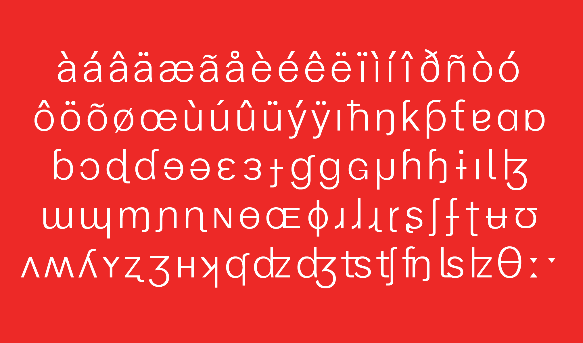

By Chalermpol Jittagasem · San Francisco, California, USA
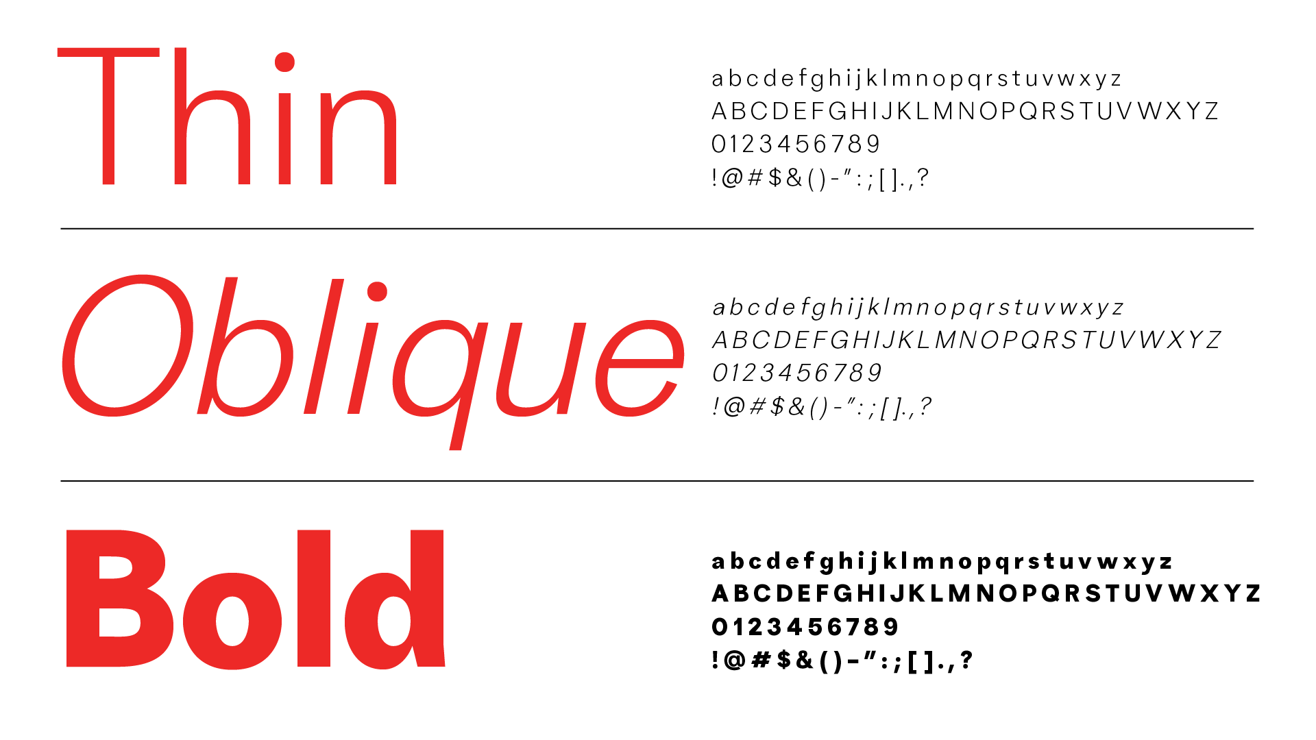
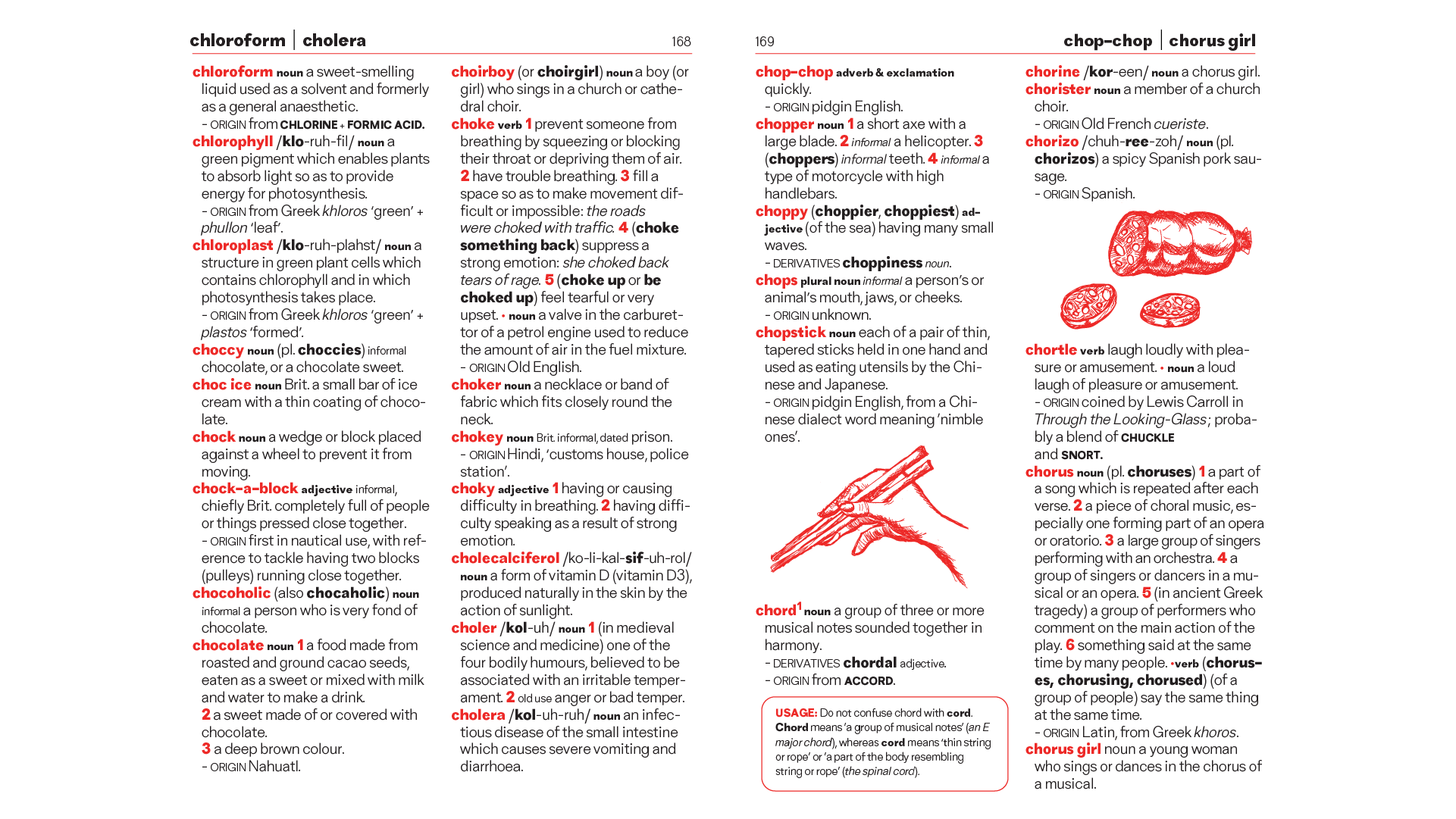
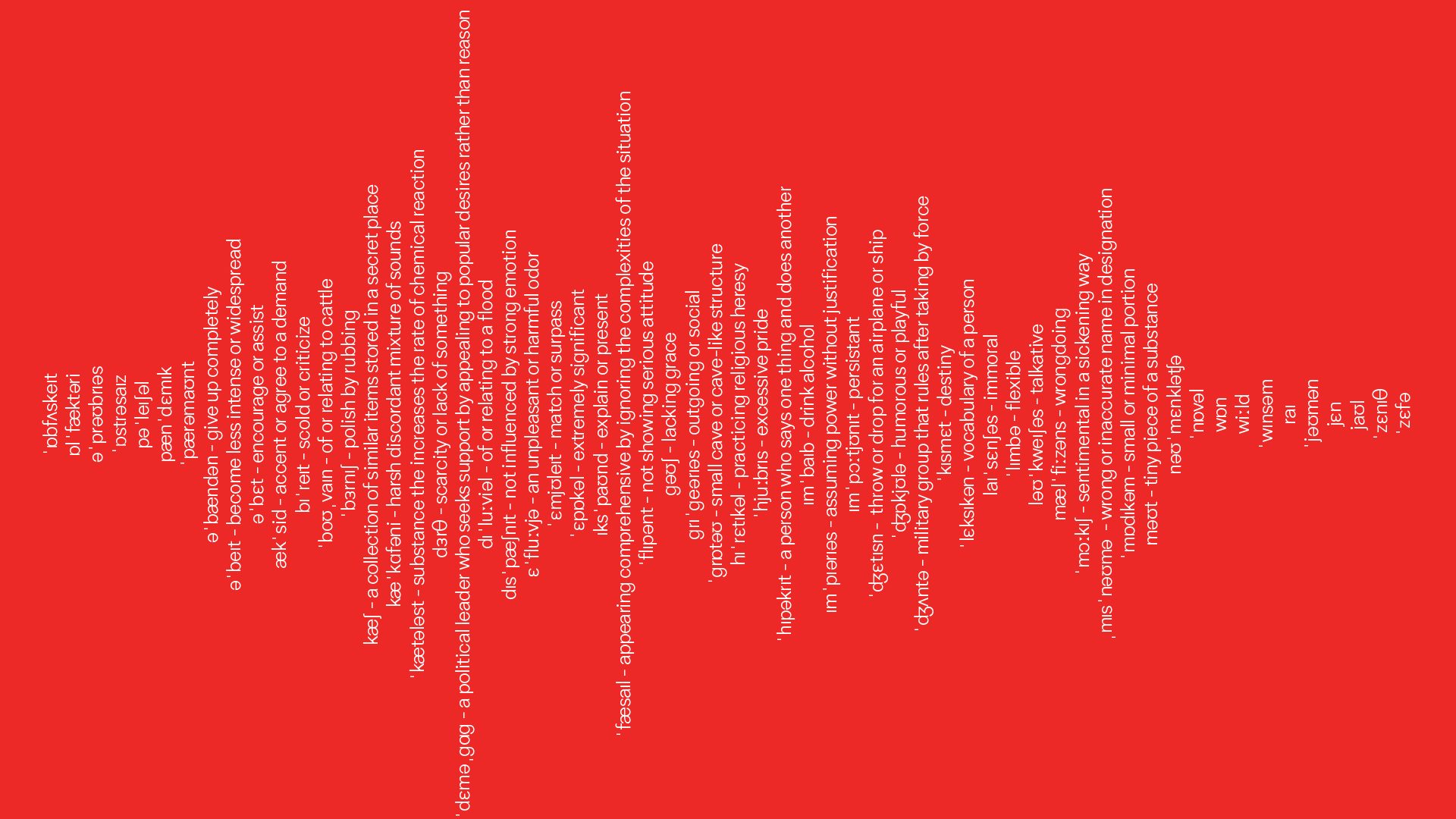
Vaja is a sans-serif typeface. A translation of Vaja in Thai means ‘Speech’. The typeface is based on Gothic Sans but infused with Geometric Sans’s personality, providing a clean and contemporary feel. Vaja also adds the terminal cut which gives a unique personality to it. Vaja was created to mainly use aiming the text to be easier to read in small sizes, especially in the Dictionary. Currently comes with 3 styles: Thin, Oblique, and Bold. Vaja focuses on pronunciation improvement for English learners, the IPA characters are added to represent speech sounds in written form to facilitate English learners to pronounce words accurately.
