
By Josh Yule · San Francisco, USA
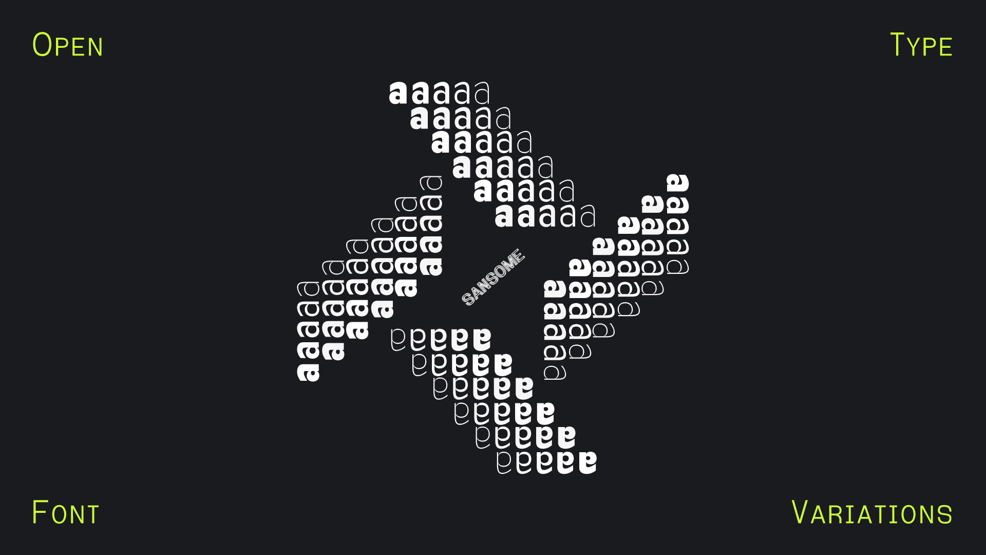
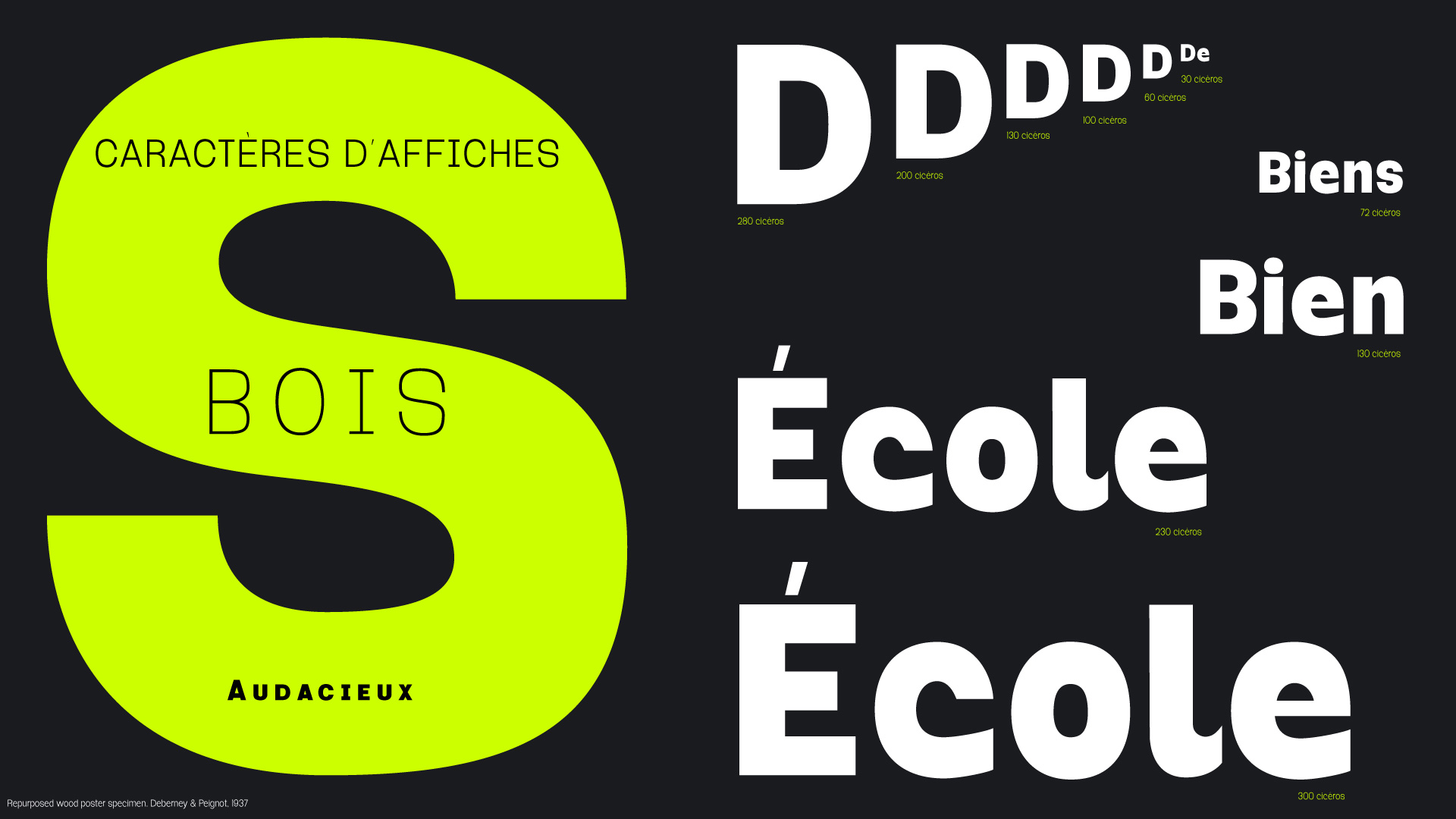
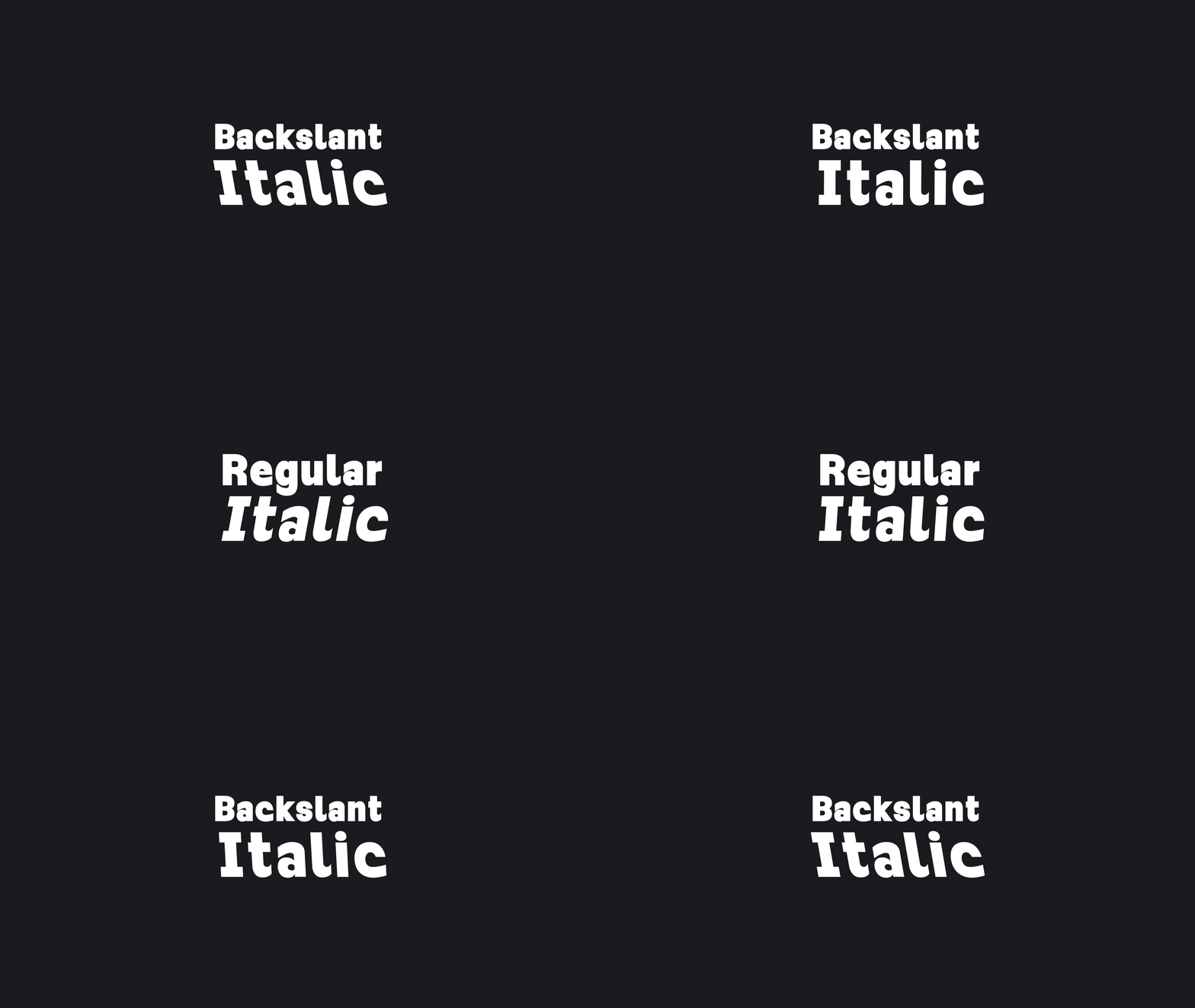
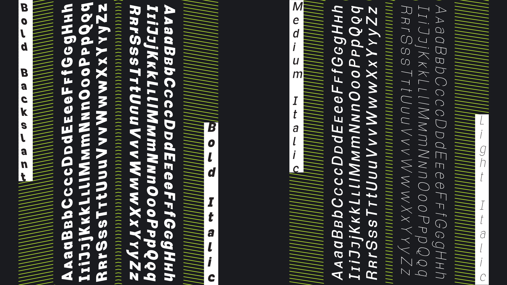
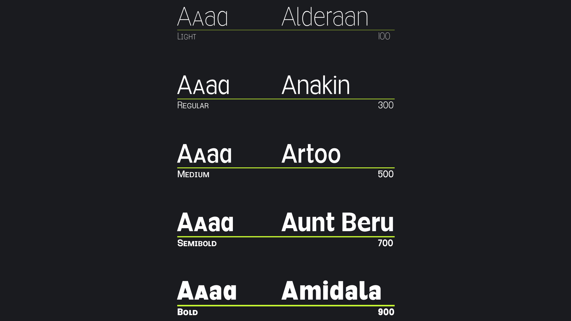
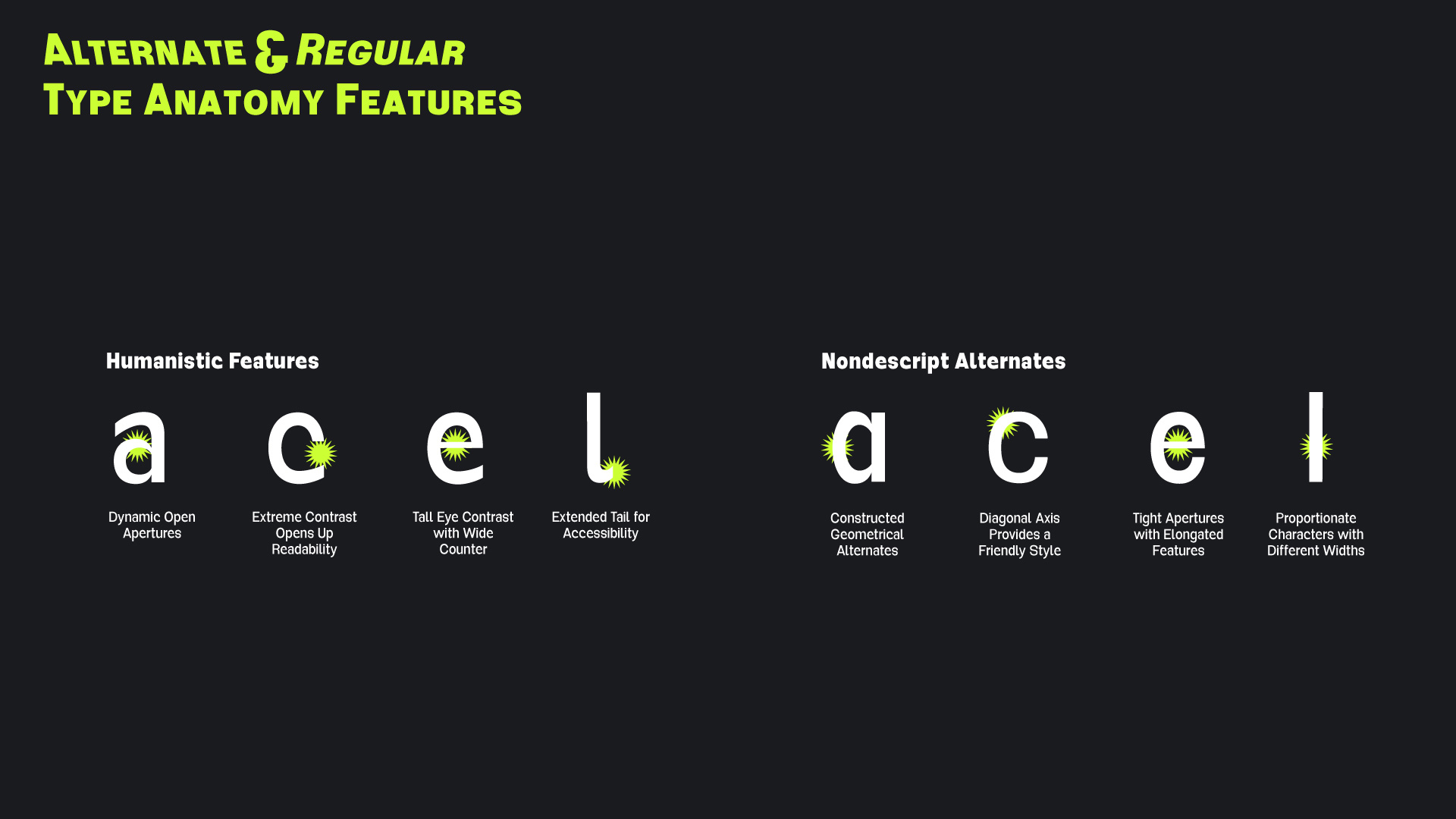
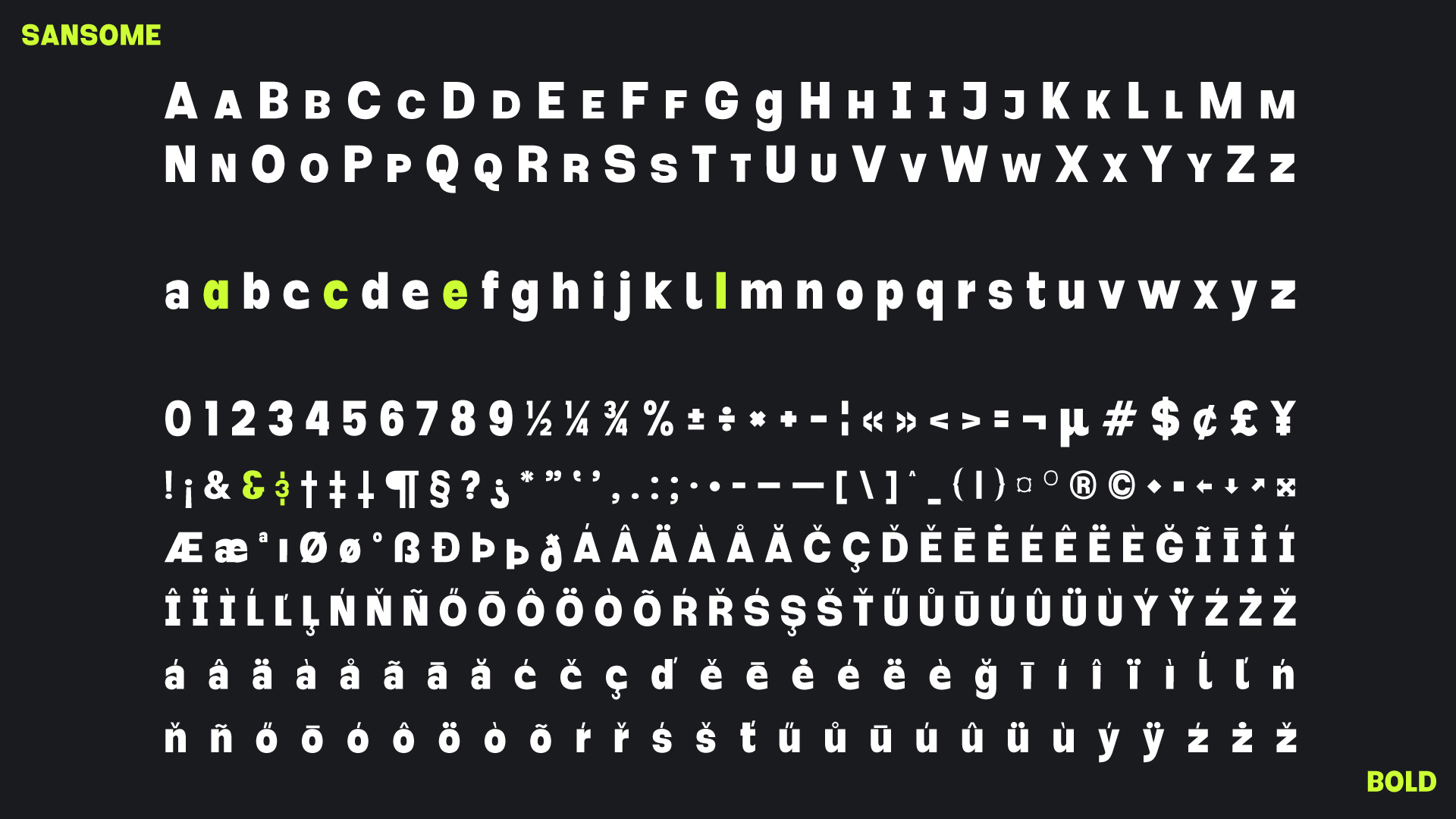
Sansome was designed as a modern geometric sans serif gesturing a nod to the grotesques of the past. Over time Sansome morphed into something more playful yet still refined and thoughtful with accessibility for all. With striking humanistic features and optically perfect oval shapes spanning from Bold to Thin and italics as well. Sansome’s large range is suitable for either reading long strings of text from the screens of any device, applied effortlessly to large format wayfinding systems, or for all those projects in between.
Characterized by a high x-height and interface elements, the easily distinguishable lowercase letterforms remain clean and soft in smaller sizes. The smooth contours set the tone for large display text.
Highlighting the importance of accessible typography Sansome also demonstrates a clear benefit for all users, including those with disabilities. When we apply an inclusive lens to design techniques and readability we then open the door for all.
Josh is a graphic designer & ok musician/entertainment booker/DJ that calls mostly foggy San Francisco home. “Wait, ya know what? Let’s go ahead now and add ‘esteemed type designer’ to this blurb as well.” Thanks Type West!


