
By David Sargent · Brisbane, Australia
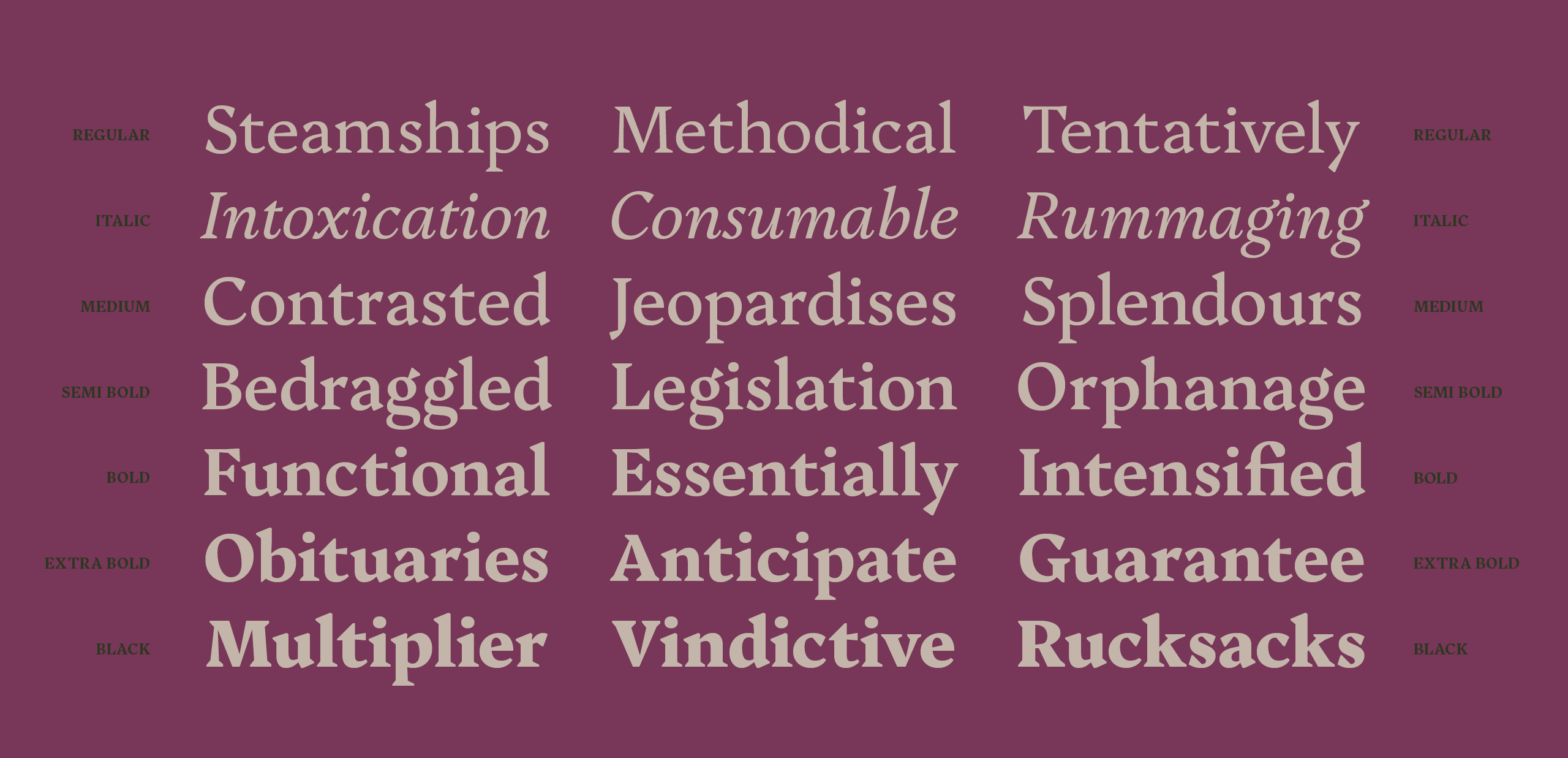
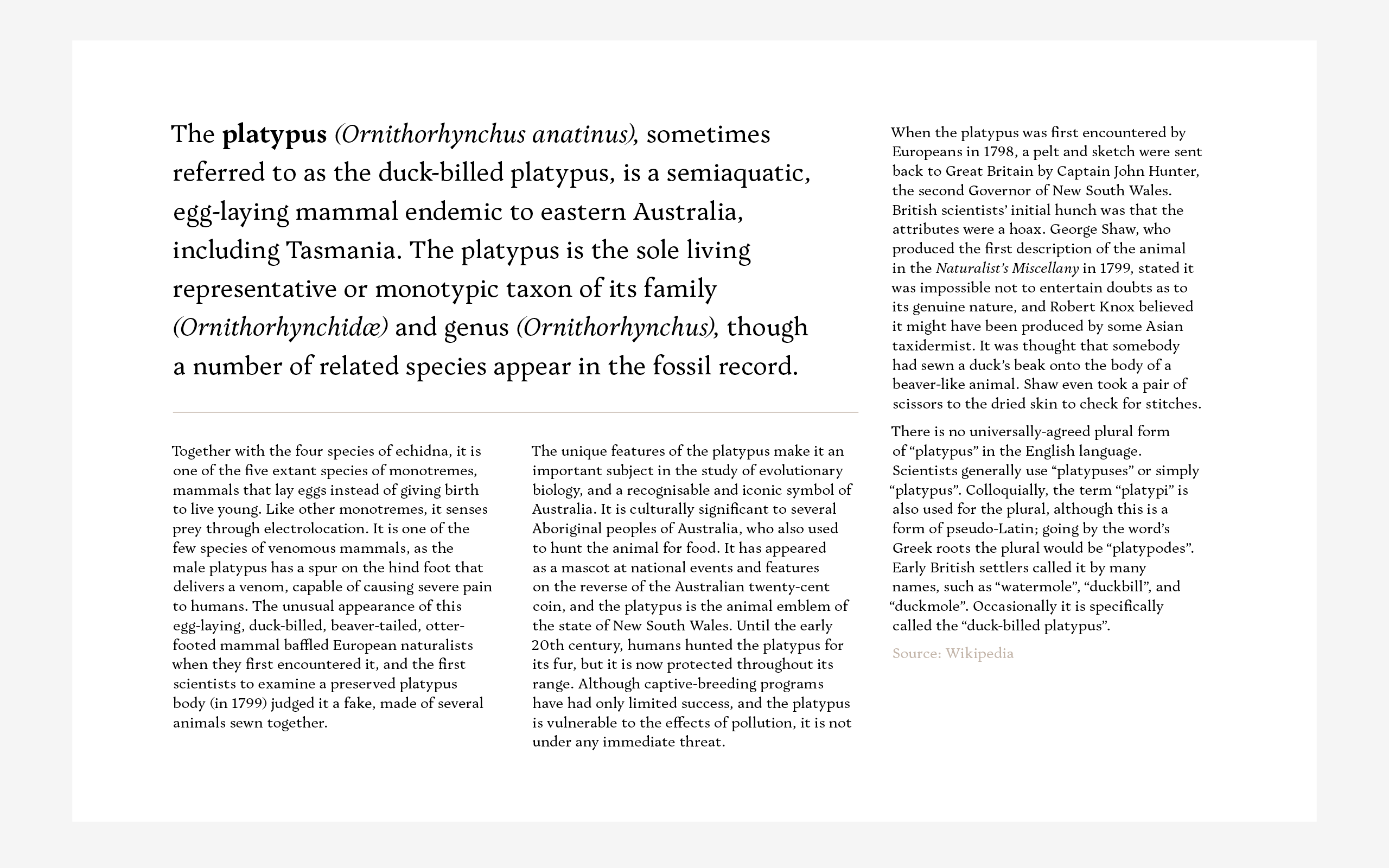
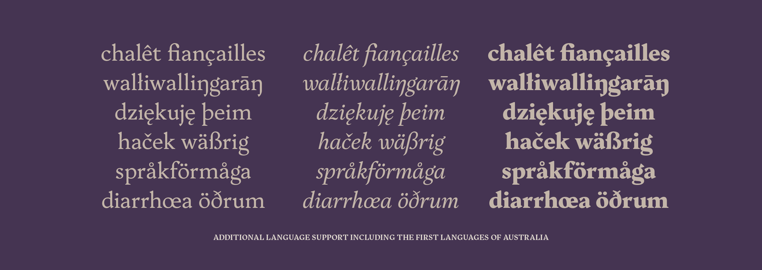
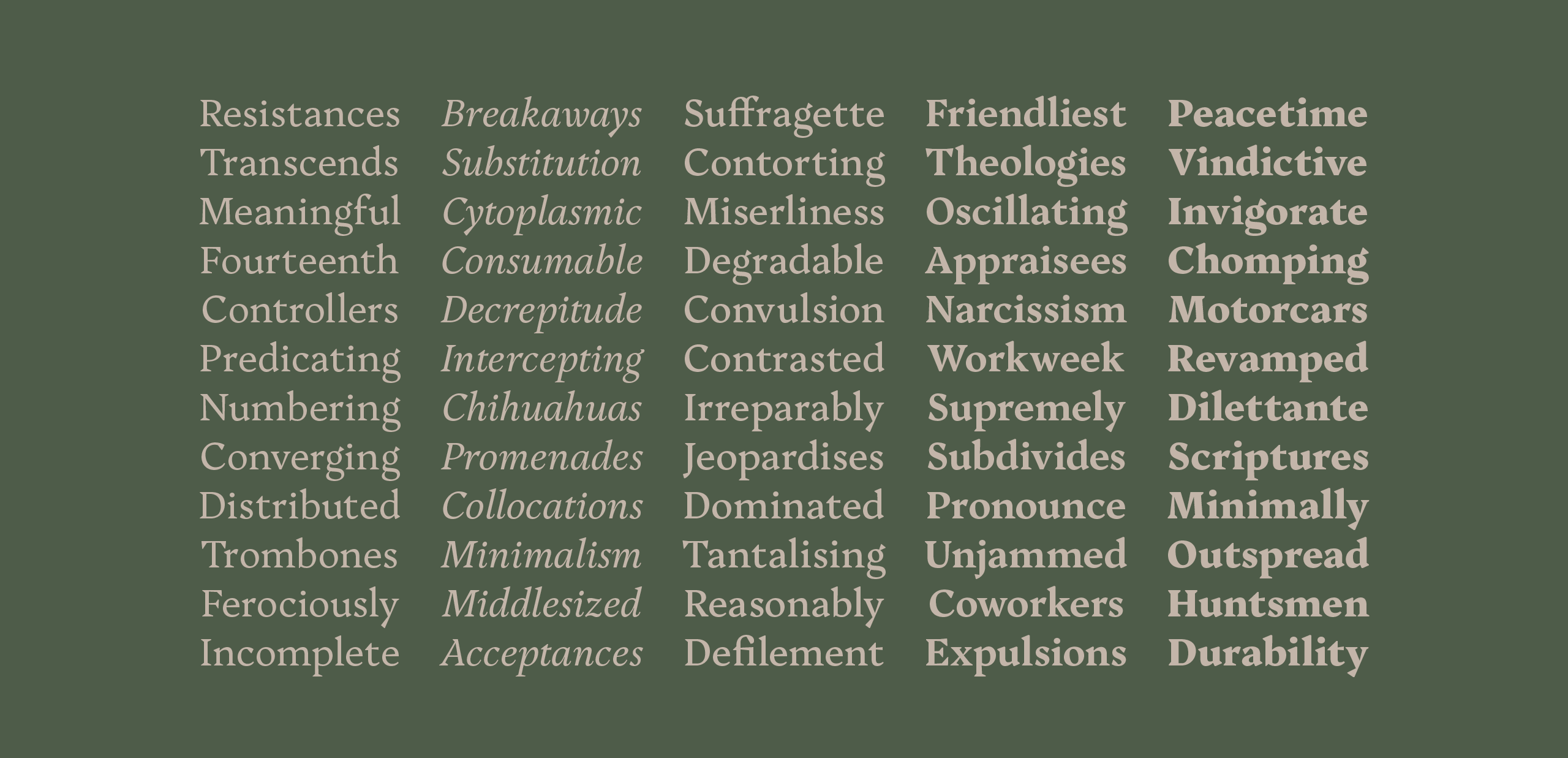
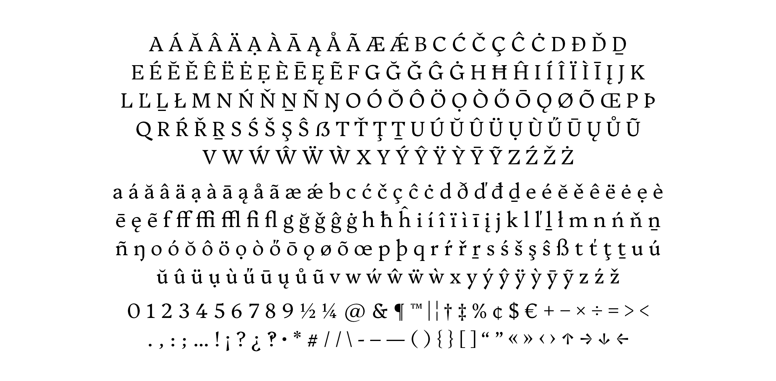
Inspired by the enigmatic platypus, Platypi blends unexpected features with conventional approaches. Dramatically tapered strokes and sheared serifs combine with smooth curves and traditional proportions to achieve a functional text typeface with a unique and distinctive visual rhythm. Heavier weights push this tension further with increased tapering and overall contrast. Platypi comes in multiple weights from Regular to Black, alongside a Regular Italic style. This project is dedicated to the memory of Donald Welch, an educator and colleague who significantly influenced my design practice and how I see the world.
David Sargent is Creative Director of Liveworm, an award-winning design incubator within the Queensland College of Art, Griffith University, Australia. As a designer, artist, and researcher, David is interested in how creative design practice can entertain, engage, communicate, and spark social change.
